- All Posts
- /
- Promotional Emails: 33 Examples, Ideas, and Best Practices
Promotional Emails: 33 Examples, Ideas, and Best Practices
Messaging and Automation-
 Chris Hexton
-
Updated:Posted:
On this page
We all have go-to ways to create great email campaigns. While it’s not always easy to crack how to get your recipients excited about promotional emails – now you can use our shortcut.
There’s no one promotional email template to follow to verify campaign quality, but there are many elements that make your offer complete.
In this guide, we’ll look at 9 categories of great promotional email samples, and give you key takeaways that will teach you how to write a promotional email that will delight recipients and drive more revenue for your business.
What is a promotional email?
Promotional emails are a simple, yet powerful way to spread the word about your product or service. The objective of promotional emails is to increase awareness, generate revenue or improve customer retention/ loyalty.
Promotional emails are an essential part of any effective email marketing strategy.
According to recent studies:
- 49% of customers said they would like to receive promotional emails from their favorite retails brands on a weekly basis (Statista).
- Nearly 80% of retail professionals indicate that email marketing is one of the greatest drivers of customer acquisition and retention (eMarketer).
- For every $1 you spend on email marketing, you can expect an average return of $44 (WordStream).
Annotations in Gmail’s Promotions tab
An important thing to keep in mind when designing promotional emails is email deliverability and inbox placement.
Remember, the Promotional and Social Tabs rollout back in 2013? Gmail introduced this update to improve the user experience, by filtering emails into tabs based on sender and content.
Now in 2019, a new update has arrived – Annotations in the Promotions tab. Gmail annotations help you engage customers by highlighting:
- Custom Logos
- Deal Badges
- Single Image Previews
- Expiration dates
- Promo Codes
These annotations are displayed in the inbox preview on both Android and iOS (scheduled to roll out on desktop early this year), giving you a great opportunity to highlight key information like deals, expiration dates, and promo codes.
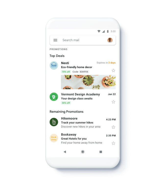
Image source: Official Gmail blog
This new annotations feature has been created so that Gmail can rank the most relevant promotional emails and provide customers with a better email experience.
The email ranking is based on Google’s specific filters, and your customer engagement metrics will impact the visibility of your emails. Using Gmail annotations will help your email qualify as a ‘Top deal’, although it’s not guaranteed. All other promotional emails are placed in the ‘Remaining promotions’ section.
Read this guide to find out how to add Gmail annotations to your email.
34 Promotional Email Examples
Now, let’s jump to the promotional email examples that especially stood out to us.
[toc_chapter_title color=”purple” number=”1″ title=”Special Offer Emails”]
[toc_chapter_title color=”purple” number=”2″ title=”Sale Emails”]
[toc_chapter_title color=”purple” number=”3″ title=”Holiday Offer Emails”]
[toc_chapter_title color=”purple” number=”4″ title=”Event Announcement Emails”]
[toc_chapter_title color=”purple” number=”5″ title=”Upgrade Emails”]
[toc_chapter_title color=”purple” number=”6″ title=”Click-Bait Emails”]
[toc_chapter_title color=”purple” number=”7″ title=”‘Did You Know?’ Emails”]
[toc_chapter_title color=”purple” number=”8″ title=”Apology Emails”]
[toc_chapter_title color=”purple” number=”9″ title=”Invitation Emails”]
And the best bit: Key Takeaways
Special Offer Emails
Be careful with special offer emails. This is the kind of stuff that’s nearly guaranteed to end up in the “Promotional” tab in Gmail. It’s the kind of stuff that people get really annoyed with. When you send a special offer, segment your audience and use personalization to ensure the offer is relevant. You don’t want to send a discount code to someone who just paid full price yesterday.
When there is real value for the customer, there can be real value for the business too. As long as you maintain that balance, special offers can be a win-win.
Headspace
Subject line: There’s no time like the present
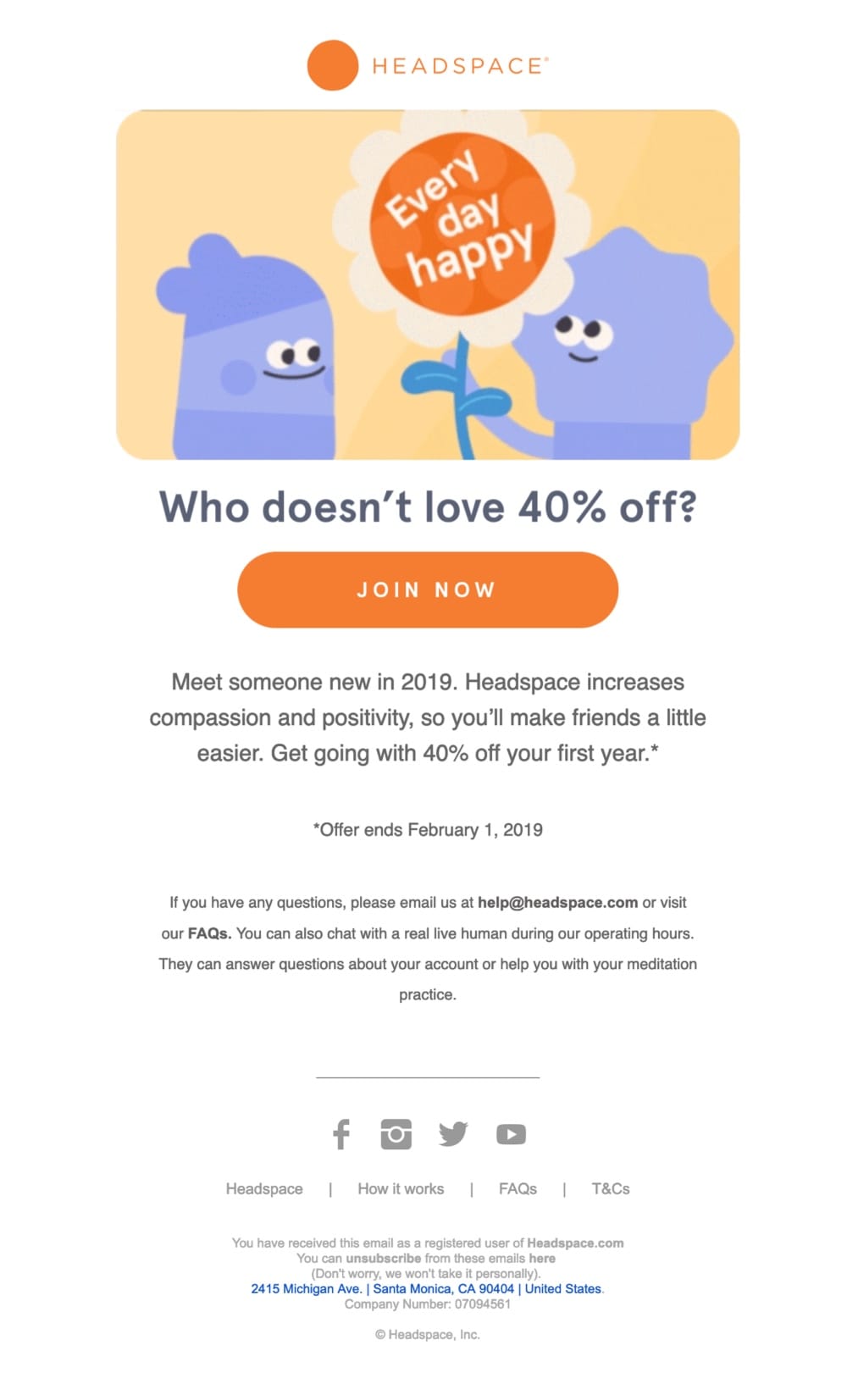
Headspace’s promotional email is one of our favorite samples. The hero image conveys friendly, positive vibes that help reinforce the benefit that the recipient will receive from Headspace. It makes a subtle and very engaging combination.
The further narrative gives you a few serious reasons to start meditating. There’s never too much positivity, compassion or new people in your life, after all! 😉
Headspace uses the email subject line to offer a clear incentive and follow up with a bold CTA to prompt action. Supported by a clear benefit that life will be better when they join Headspace.
Headspace incorporates an offer end date to introduce scarcity and prompt the recipient to take action quickly.
Moo
Subject line: Don’t forget your 10% off!
Moo’s promotion lures you in with 10% off for their great quality print products. The brand again builds up trust with a promise “if your order’s not exactly how you pictured it, we’ll reprint it for free!” That efficiently eases anxiety about making a purchase.
Sounds like a bulletproof sales offer.
Check out Moo’s welcome email example to understand how they craft an excellent email experience.
Space NK
Subject line: Enjoy £15 off every £60 spent
This is a great promotional email example. Space NK uses everything from a money-off incentive, scarcity – ‘Limited time only’, social proof to personalization.
Also, Space NK uses social proof which gives you some ‘top-rated’ shopping ideas and 5-star reviews from other customers. This eases customer anxieties about whether the brand is reputable and can be trusted.
Space NK uses specific user account information to personalize their emails with relevant product recommendations and account usage summary.
Although there are many, small “Shop now” CTAs sprinkled across this promotional email template, the primary CTA is clear and stands out from other content.
Moo 2
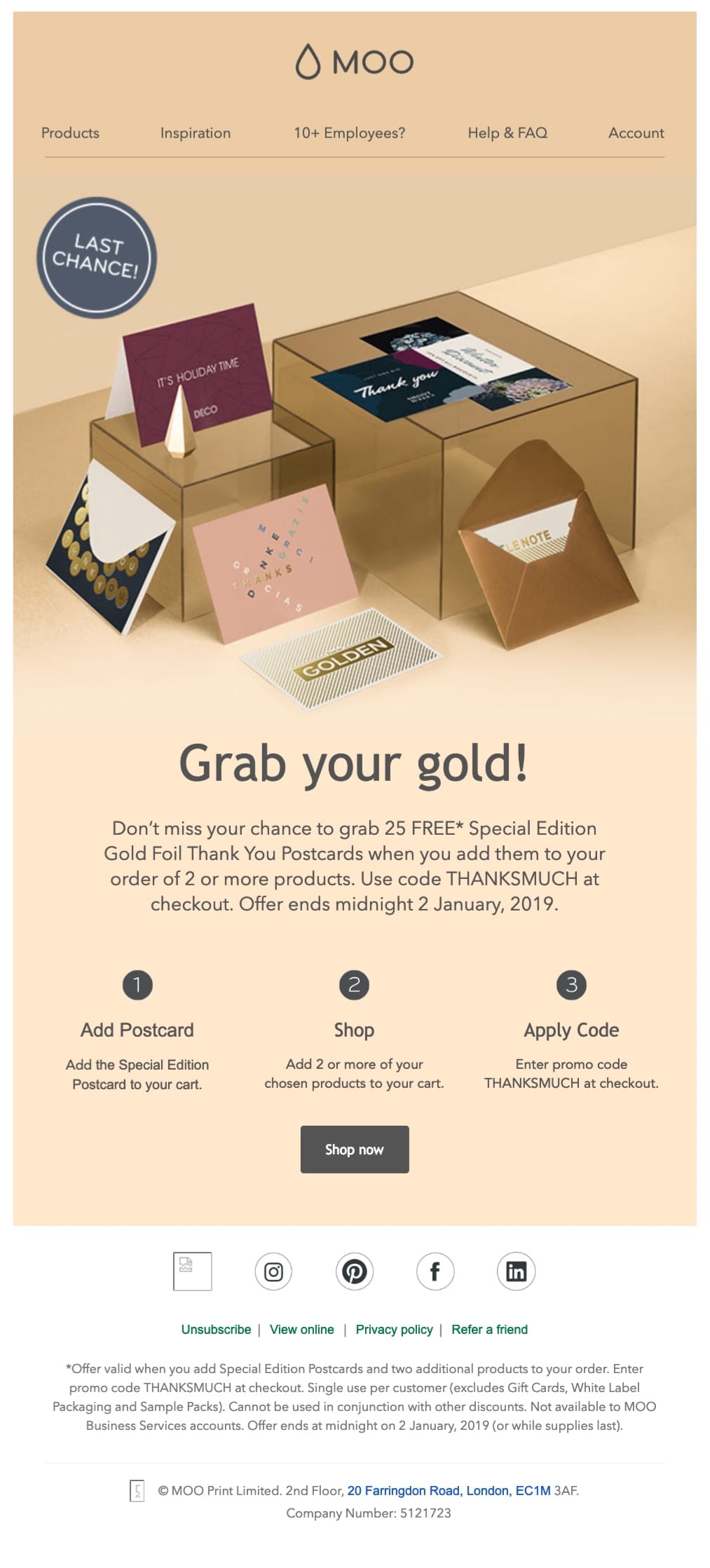
Subject: Special Edition. Gold Foil. ALL YOURS with your next purchase.
Just one more promotional email from Moo. As you can see, they structured the subject line so that it highlights all the key points of this offer.
Moo uses the image ‘Last chance’ and body copy ‘Offer ends midnight 2 January 2019’ to create a sense of urgency to act fast. Without a limited time offer, recipients may decide to leave the purchase until later, and some will likely forget about it completely.
Cialdini’s six influences of persuasion include the principle: scarcity. This is based on the premise that people are more likely to do something if they believe the opportunity to do so may not come again. We don’t like to miss out, so we want to do something while we have the chance.
This scarcity principle is commonly used in two ways: limiting the offer by the volume available (short supply) or limiting the offer to a specific time period.
Read more about Cialdini’s six principles of persuasion and how to apply them to your promotional emails to increase conversions.
500px
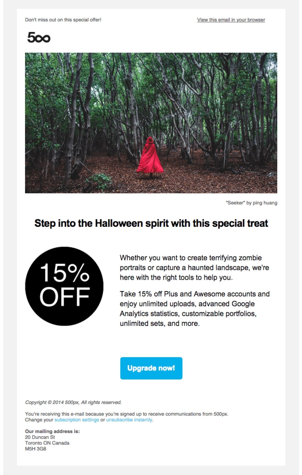
Subject line: Boo! Enjoy this Halloween treat
Most 500px users are familiar with “Plus” and “Awesome” accounts. They are mentioned frequently in emails and calls to action to upgrade are all over the site. So when an email shows up offering a discount, there is a foundation of knowledge in place.
The important parts of this product promotional email sample – “15% off” and “Upgrade Now” – contrast nicely with the white background. Users will know exactly what to do.
CrashPlan
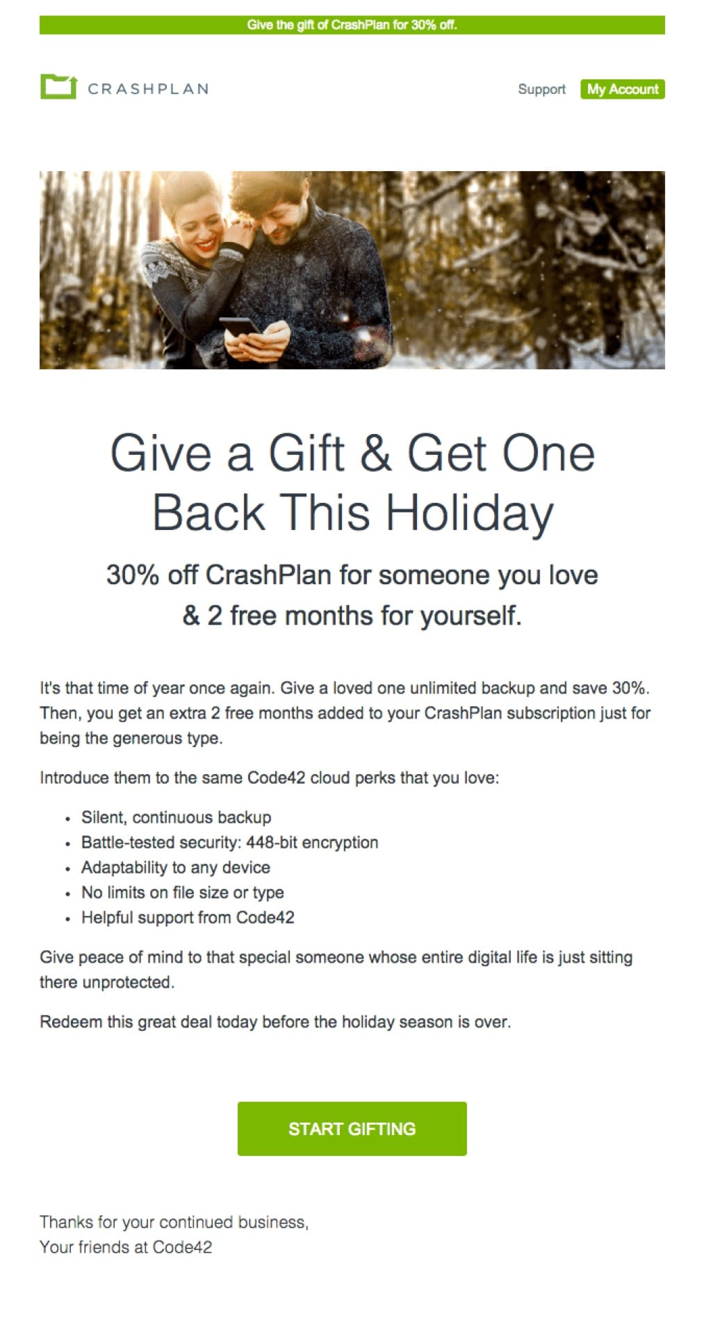
Subject line: Save on CrashPlan Gifts & Get 2 Months on Us
The copy in this promotional email is all about giving, not getting.
Special offers are often seasonal and CrashPlan did something interesting with this holiday email. If you give CrashPlan to someone else, you get two free months for yourself. This is useful to people are the holidays and the added incentive makes it an especially useful email.
eBay
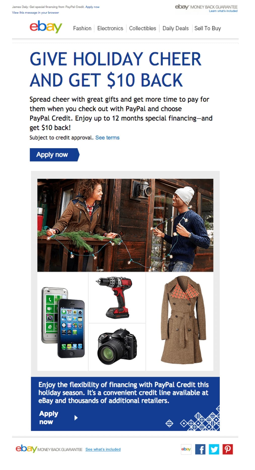
Subject line: You have a special offer from eBay
This special offer is framed liked a transactional email. The subject line – “You have a special offer from eBay” – sounds more like a casual notification than a promotional email campaign.
The offer itself is sold by the items you could have, if only you had PayPal Credit. This is a perfect example of benefits over features.
Starbucks
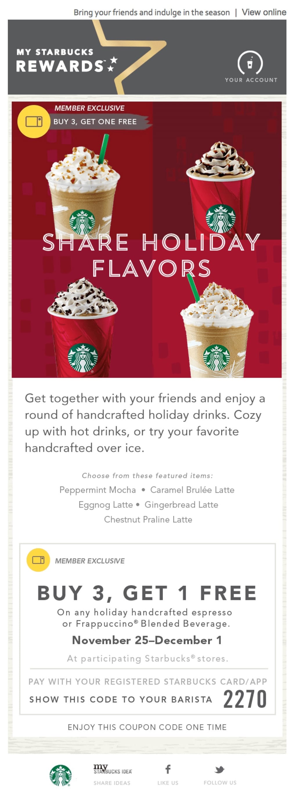
Subject line: Enjoy 3 holiday drinks, get another free
It’s not surprising to see a great email from Starbucks. They send some of the best promotional emails out there (Also, see their newest welcome email).
In this email, which is sent only to “members”, they offer a buy three, get one free deal for a very limited time. Nearly all Starbucks offers are time-sensitive. This is because they need people to actually come to visit a location, not just order things online.
Sale Emails
Avoid the gray area of email marketing. You know, that space where you aren’t really sure if the email you’re sending will end up in the inbox or a spam folder. Sale emails can be dangerous. Send them only to people who have explicitly requested them and consistently engage with your emails.
Low engagement rates are a spam signal. Tread lightly.
Zalando
Subject line: Last orders: spend more to save
Zalando’s example embraces simplicity, personalization, and visualization. This promotional email is based on a very simple message “Spend to save”.
Also, the narrative creates a sense of urgency in the subject line and first paragraph. You’re advised to hurry up since the clock is ticking and this sale will end soon.

Grammarly
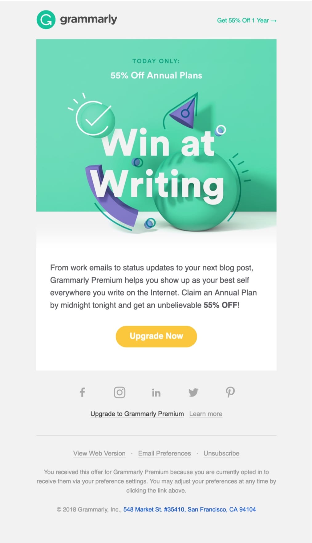
Subject line: TODAY ONLY: 55% OFF Annual Plans
This Grammarly’s promotion uses a hands-on-deck rule and bets on a solid money-off incentive. And TODAY ONLY in the subject line creates a sense of urgency to encourage recipients to take action and open the email now.
The Guardian
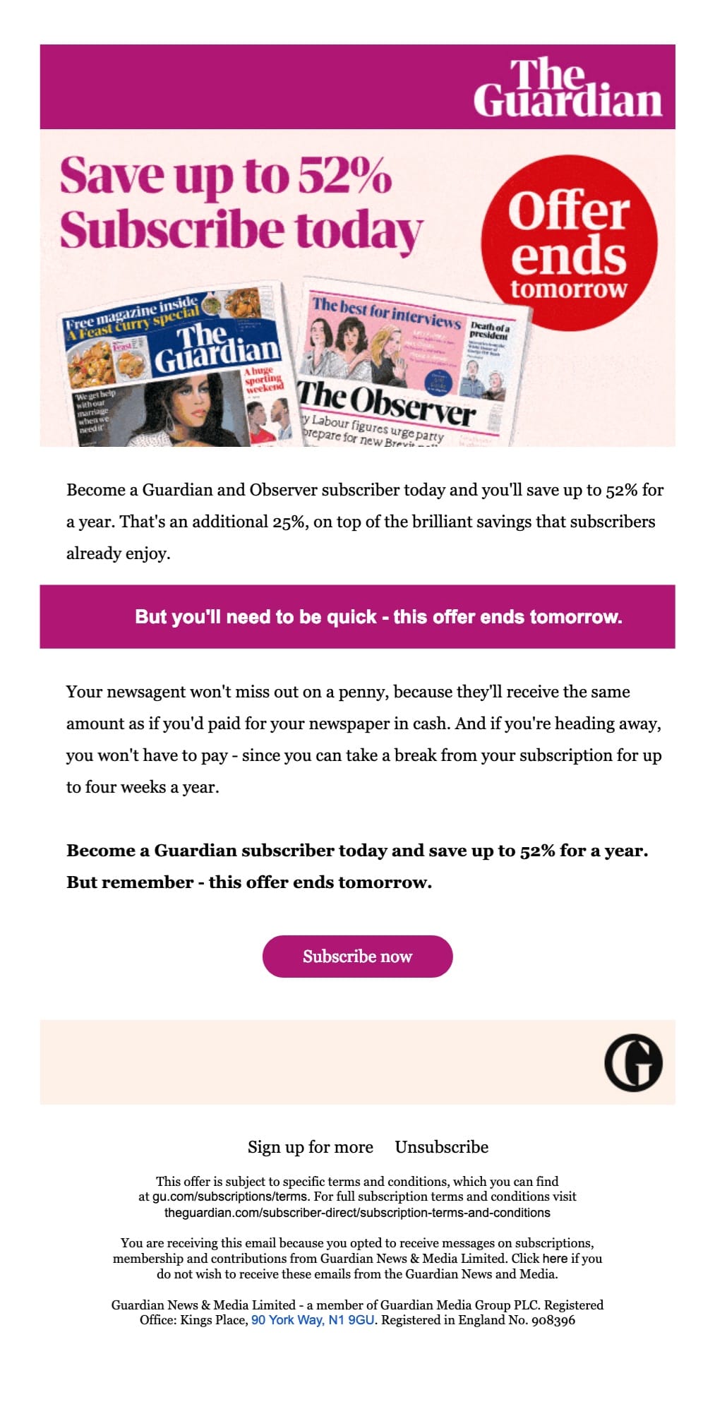
Subject line: Save up to 52% – offer ends tomorrow
In addition to the solid 52% discount on the annual subscription, limited to 24 hours, you have an extra incentive: two newspapers (The Guardian and The Observer – the sister newspaper published on Sundays) at a single price.
Crate and Barrel
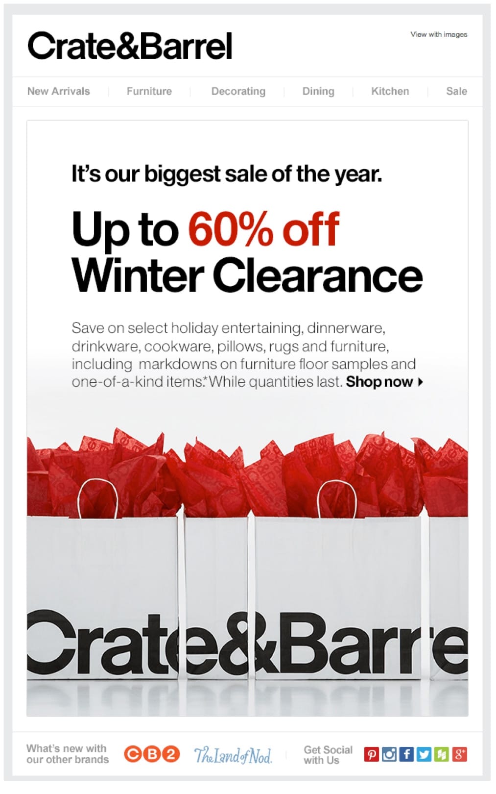
Subject line: Our biggest sale of the year.
Crate and Barrel does a great job emphasizing the “60% off” in a contrasting color. That number is key and this entire promotional email is built around drawing attention to it.
Jackthreads
Subject line: The Jacktober Sales Event Starts Now
This sales promotional email sample is loaded with eye candy. The photos are great, the clothes and accessories look great and there are several calls to action in the body of the email.

Target
Subject line: Prep for less with the home for the holidays’ sale.
This is a common theme you’ll see from big retailers. They throw a bunch of things at the wall and see what sticks. If you’ve got data, it’s much better to personalize but if your product selection is as broad as Target’s, you can use it to your advantage.
This promotional email works because it gets the customer thinking about possibilities. “I don’t need a new camera but that’s a really good deal.” Use this tactic carefully as it can backfire.

Holiday Offer Emails
Everyone expects to get more emails during the holidays.
You have a green light to send a promotional email (to people who opted in) but not to badger your subscribers or annoy them.
Use the built-in context of the holidays to craft a message that will be welcome in the inbox.
Tod’s
Subject line: Valentine’s Day – Somebody to Love
Tod’s newest promotional email is definitely something to see. They use colors and a short message to transport you to their picturesque fairy tale and tell captivating stories to drive your attention. All of Tod’s campaigns are stylish and consistent. Clear terms of the offer are highlighted at the top of the email to keep you informed and the offer transparent.
The newest Valentine’s promotional email aligns with Tod’s overall marketing communication. Tod’s team knows how to add some sugar, but not overdo it, and keep it classy.

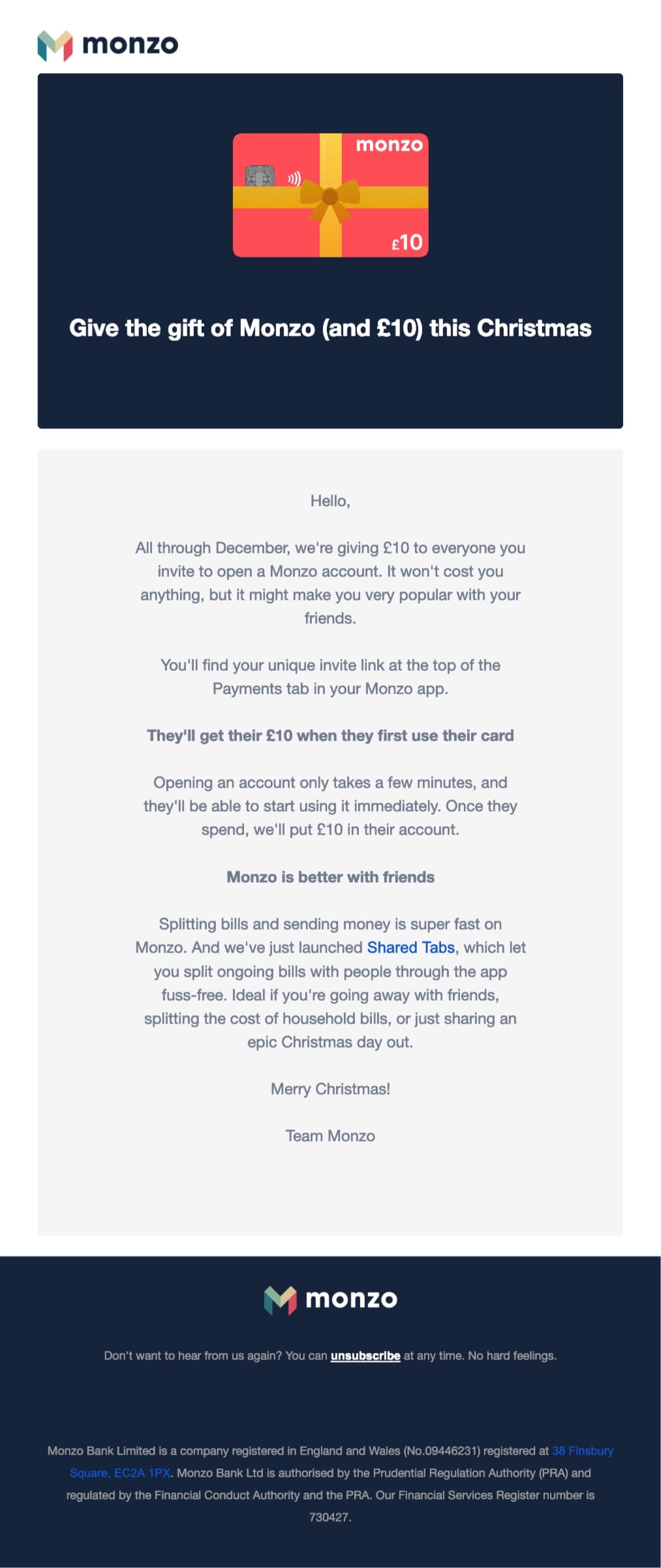
Monzo
Subject line: Give the gift of Monzo this Christmas
Christmas it all about giving. With Monzo, you can share a discount of £10 with your friends, and make them happier during this special time of the year.
Monzo’s Christmas offer is a fine example of how to use seasonality to promote your customer referral program. Each friend you refer will receive £10 when they become a Monzo customer. This is a great way to reach new customers and reward existing customers.
Good idea!
Harry’s
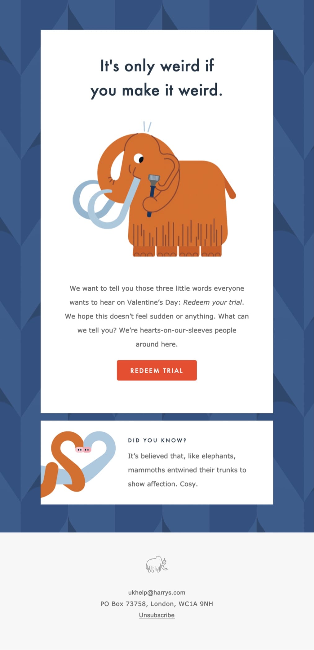
Subject line: A Valentine, from you to you
Harry’s promotional email uses a genuine sense of humor and conversational tone of voice to upgrade its trial users on Valentine’s day. Harry’s do a great job at making a tenuous link with the occasion and their offer. We’ve picked out some best practices used in this email:
- Intriguing subject line; it’s playful and conversational
- Strong, beautiful imagery looks grotesque and hilarious
- Clear CTA, implies action and the benefit at the same time
- Scannable and easy-to-digest
This example shows a different perspective on Valentine’s Day and proves you don’t have to go with the flow. Sometimes a less conventional approach can be more engaging.
Amazon
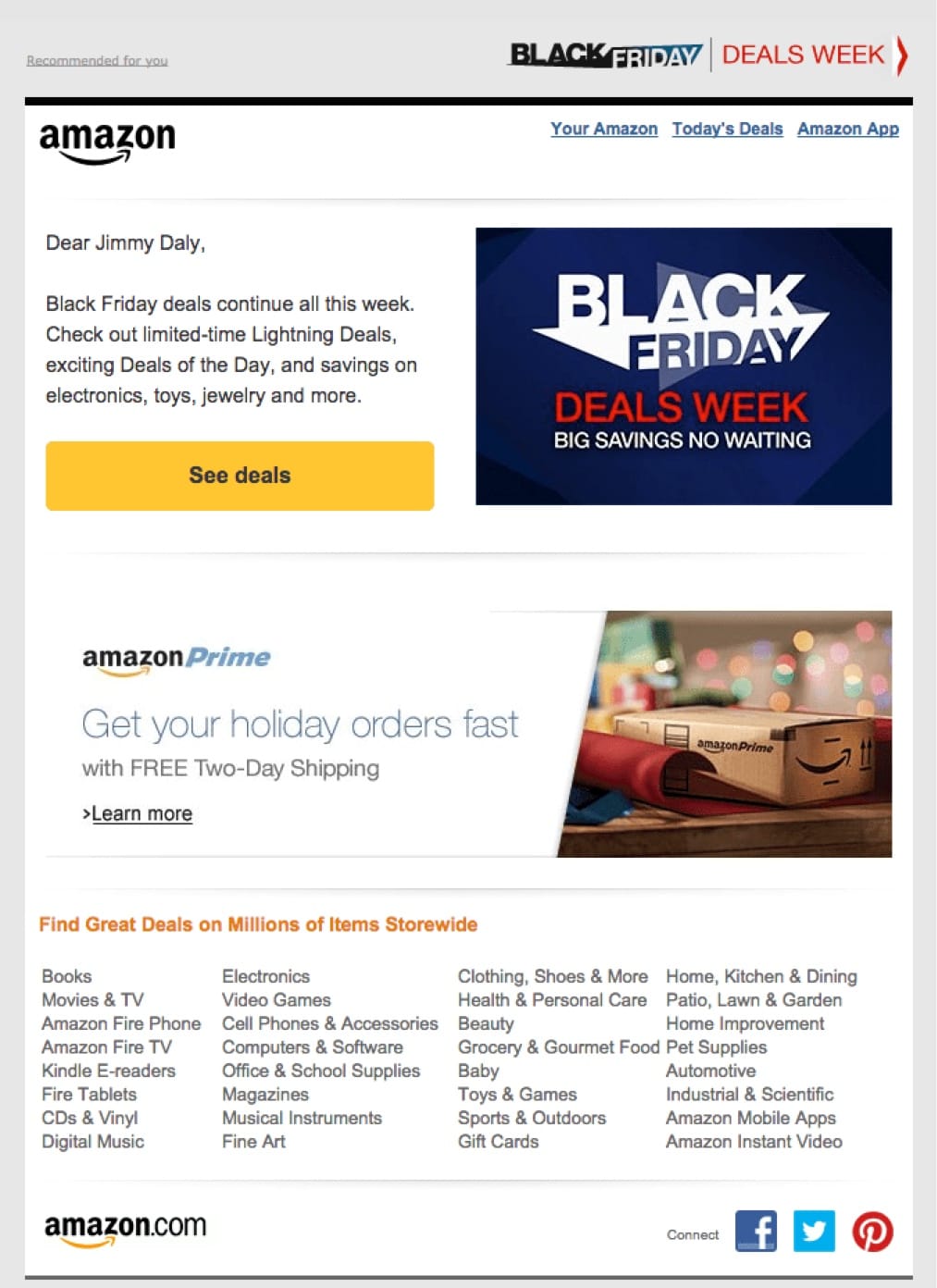
Subject line: Black Friday Deals All This Week
By the time customers receive this email, they’ve likely already heard a few news stories about how Amazon is prepping for the holiday season. They know the deals will be good. The context is already there. This email is just a green light to start shopping.
Event Announcement Emails
You have two options when it comes to announcing events via email. You can include the announcement in an exiting email (like a newsletter) or send a separate email dedicated to the announcement. Both can work and we have examples of each.
As always, the format is less important than the content. Can you concisely and clearly communicate value? Do that, and your event will be off to a great start.
ConversionXL
Subject line: Announcing: Conversion XL Live
This is an example of building the announcement into an existing newsletter. Peep does a great job using a conversational tone. If you’ve read the blog, it sounds like Peep. He sells the conference but he doesn’t go overboard. Why? Because if you’ve already subscribed to the newsletter, you already know ConversionXL does great work.

KISSmetrics
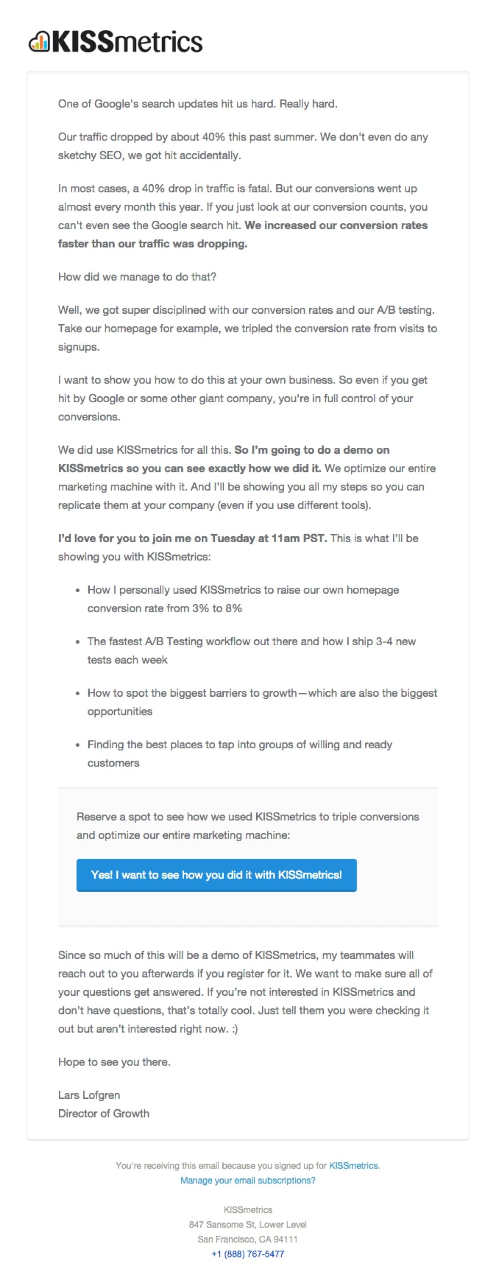
Subject line: How we survived a 40$ traffic hit from Google
This is a different approach. KISSmetrics sent this email with the sole purpose of announcing the webinar. It’s rare that startups are willing to talk about their challenges so they get your attention from the beginning. The story builds your interest before sealing the deal with a call to action.
Unbounce
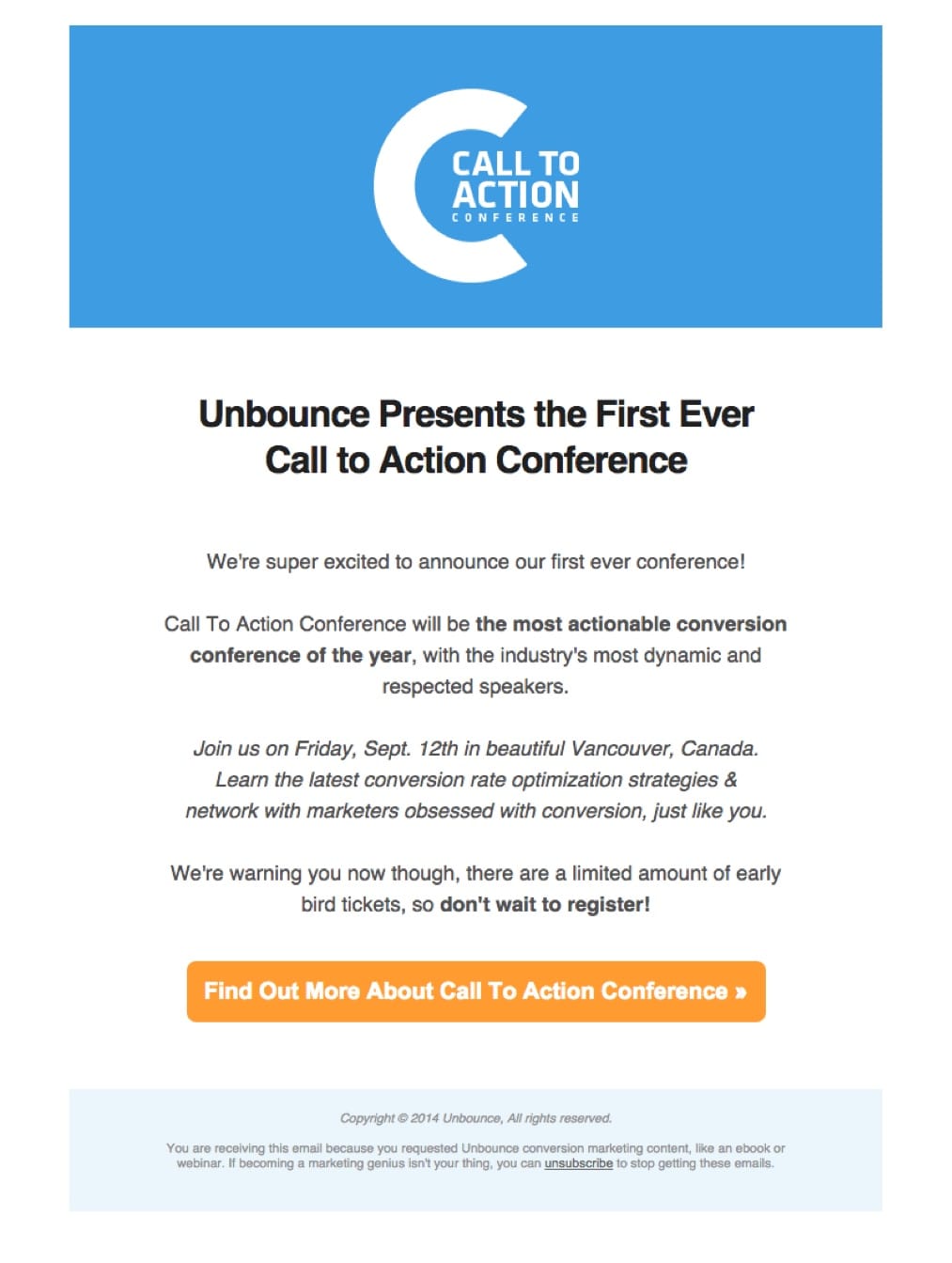
Subject line: Announcing The 1st Unbounce Call To Action Conference!
Another example of a dedicated announcement email, Unbounce doesn’t waste much time getting recipients to the conference website. Conferences are big investments so people are likely to spend a lot of time researching before they commit. The landing page really sold the show. This email was just a catalyst.
Upgrade Emails
Buffer
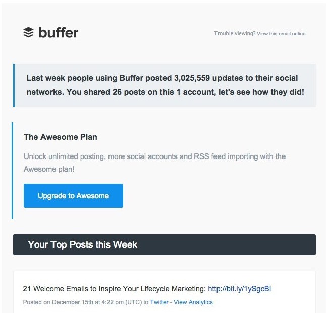
Subject line: Your Social Media Report Card: Dec1 5 – Dec 21
This isn’t a dedicated upgrade email… or is it?
In this report that Buffer sends each week, they ask users to upgrade above the fold. Recipients see the call to action before they even see the metrics. Upgrade emails exist in many forms. There are a few different approaches in this section. Pay special attention to Buffer as they seem to be onto something great with their version.
TripAdvisor does something very similar. This is a great example of making the most of transactional email. Users like receiving their reports and probably feel good about the metrics. It’s the perfect time to ask them to upgrade.
Spotify
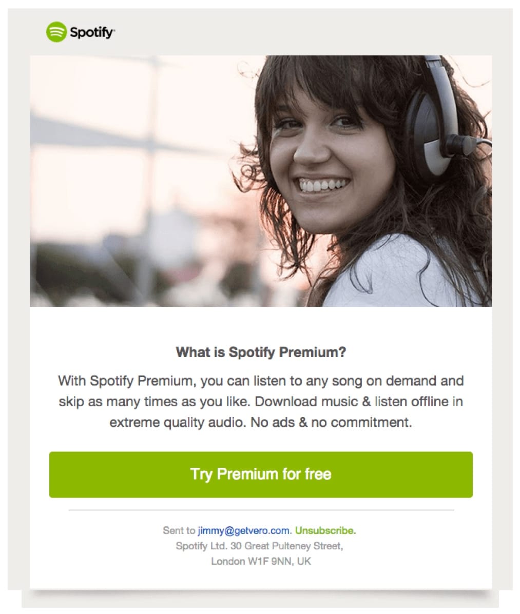
Subject line: Let us introduce Premium – you’ll love it!
Instead of going for the upgrade right away, Spotify lets you try their premium service for free first. And the service is great. Email marketing always works best when the product does the selling for you.
Todoist
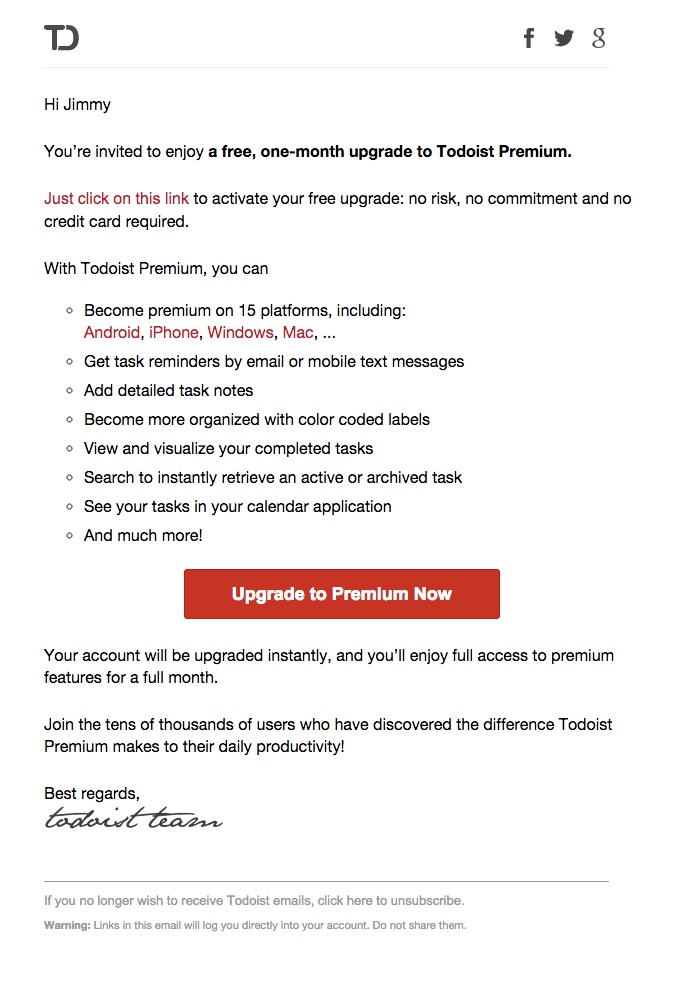
Subject line: Love upgrades? Test Todoist Premium for Free
This approach is similar to Spotify but Todoist spends a little more time on the benefits of the service. This is useful to newbies since the software does so much.
The emphasis on “no commitment and no credit card” alleviates some of the anxiety around free trials. And just when the user’s interest is piqued, they bring it home with a bold, red button.
Click-Bait Emails
Why is there so much click-bait out there? Because it works.
The problem with click-bait is that the headline oversells the content, leaving the reader disappointed.
“Most clickbait is disappointing because it’s a promise of value that isn’t met – the payoff isn’t nearly as good as what the reader imagines… BuzzFeed headlines pay off particularly well because they actually make fairly small promises and then overdeliver.” – Nilay Patel (Editor-in-chief, The Verge)
Read the full post: Why BuzzFeed Doesn’t Do Clickbait
So there’s your strategy. Now let’s see how some of the pros do it.
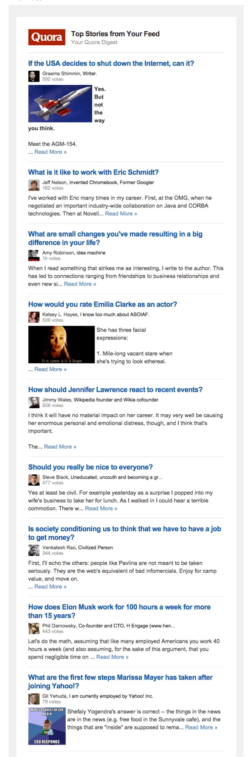
Quora
Subject line: If the USE decides to shut down the Internet, can it? – Quora
Quora lets their users generate subject lines for their emails.
Each newsletter arrives with a question from my feed, meaning the subject lines are always interesting and cover a wide range of topics. You never know what you’re going to get with a Quora email but it’s always worth checking out.
We wrote more about this strategy in 20 Tips for Dramatically Better Emails.
‘Did You Know?’ Emails
Survey your customers about your product. I bet you’ll find that they know about half of what it does.
“Did you know” emails are great for onboarding and inactive users. They can be promotional or behavioral. We suggest the latter since highly targeted behavioral emails consistently perform better than promotional emails.
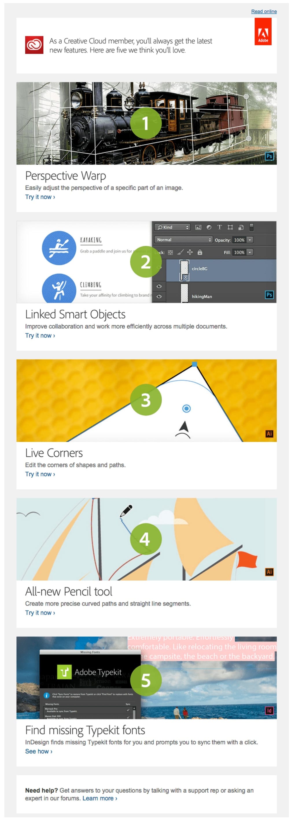
Adobe
Subject line: Five Creative Cloud features we think you’ll love
If you’ve ever used Adobe’s tools, you know they are beastly. Powerful and useful, yes but overwhelming.
Now that most Adobe users pay a monthly fee to use their creative suite, it’s important to continually remind users that they are getting something great for their money. This promotional email is a perfect way to engage users with the software and make them feel good about their investment.
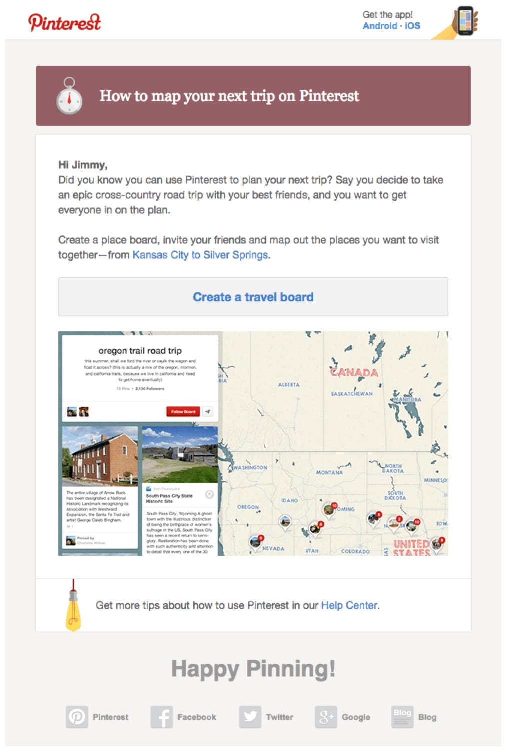
Subject line: Another thing you can do on Pinterest: Plan your next trip!
Pinterest sends a great onboarding series. Seriously, go sign up for a new account to get some great ideas for your own onboarding email.
As a new user, I didn’t know about “place boards” but after seeing this promotional email, I created one. So it worked … really well.
Onboarding emails are designed to drive engagement. So when Pinterest says “Here’s something cool you probably didn’t know” then immediately prompts the user to try it, everyone wins.
Apology Emails
Saying “I’m sorry” can be really hard but sometimes it must be done.
If you’ve upset your users or customers, email is a good way to send a personal message apologizing.
You also have an opportunity to delight the recipient (more on that here) by giving them something free or surprising them. Check out what we mean.
Buffer
Subject line: We got this one wrong. We’ve adjusted all paid plans: Now add up to 15 blog feeds.
When Buffer first added feeds to their app, users were upset because they could only add one. It was still better than before, just not as good as people hoped.
Instead of getting defensive, CEO Joel Gascoigne sent this email apologizing for the disappointment. And he announced that effective immodestly, users could add up to 15 feeds.
Now that is a great apology email.

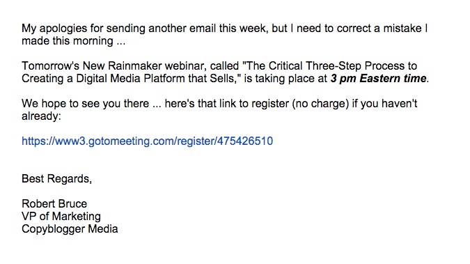
Copyblogger
Subject line: CORRECTION: Tomorrow’s Rainmaker Webinar
We’ve all sent an email we wish we could take back. Maybe it had a bad link, an incorrect date or a grammar error.
In this case, Copyblogger sent an email about an upcoming webinar but listed the time incorrectly. This email arrived shortly after apologizing for the error and for the extra noise in the inbox.
They got it right though. The correction had to be made and the email was short and sweet.
Sumday
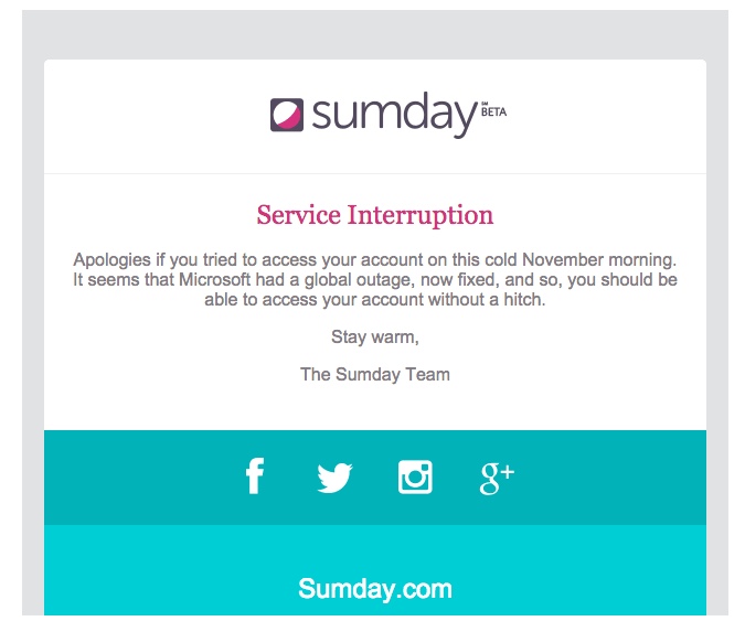
Subject line: Service Interruption
Your tech team invests a lot of team energy trying to achieve 99.999% uptime but somehow people are still upset when your site goes down. It happens, and it often requires an apology.
Sumday kept this email brief but still got the point across.
 [toc_chapter_title color=”purple” number=”9″ title=”Invitation
Emails”] If you want to make people feel special, invite them to
something. A special email list, a pre-sale, a beta group … it
makes people feel really good.
Be sure to spend time segmenting your lists before you hit send on an invitation. Don’t send them to everyone – that defeats the purpose – and try to segment based on past behavior. It’s a great indicator of future behavior.
Amazon 2
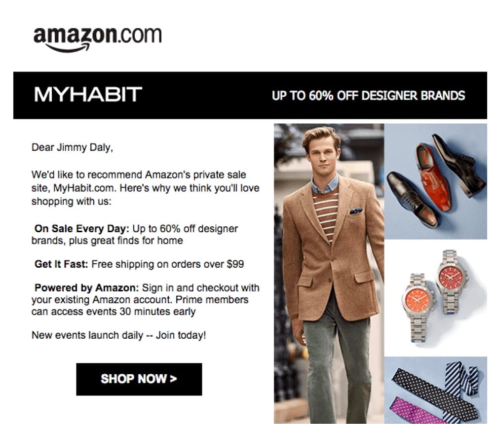
Subject line: You’re invited to join Amazon’s Site, MyHabit.com
Perhaps because I’ve made a purchase within just a few days of signing up for a new account, Amazon wants to strike while the iron is hot. In this email, they invite me to join a site called MyHabit.com that curates deals for clothing and other fashion products.
Within five days of opening the account, I made two purchases.
- October 21: Open account
- October 23: Purchase #1
- October 26: Purchase #2
- October 31: Invitation to MyHabit.com
My purchasing behavior is trending upward. They’ve had to do very little to entice me to buy. They see this as a signal that I’m ready to spend and are trying to build a habit of frequent purchasing.
Read more on this email in our post How Amazon Dominates E-Commerce With Email Marketing.
Divvy
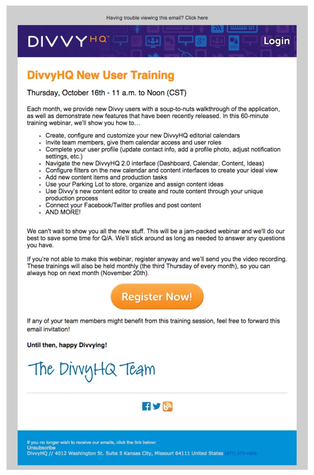
Subject line: You’re invited – DivvyHQ New User Training
Everyone is used to orientation sessions. New job, new school, new software … you need to get oriented. So this promotional email from Divvy inviting new users to orientation is not only useful, it’s expected.
Inbox by Gmail
Subject line: Your invitation to try Inbox by Gmail
Google loves to build anticipation for new products by requiring an invite to join. By the time you get this email, you are well aware of the product and itching to get your “in”.
The email starts with the good stuff … the call to action. For those wanting more information, it’s there too, complete with a video walkthrough and an explanation of the new features.

Key Takeaways
Promotional emails can be your greatest customer retention driver and effective revenue generation channel. The examples we picked out represent some of the best email marketing practices for promotional emails. Here’s a summary of the key takeaways:
- When you send a special offer, make sure you segment your lists first. You don’t want to send a discount code to someone who just paid full price yesterday.
- Use your subject line to clearly present your value proposition statement, but also make sure to make it friendly, intriguing and conversational.
- Use images or GIFs (dynamic content) to quickly communicate the benefit your readers will receive from the offer.
- Make your copy brief, but concise. Email attention spans are short – about 11 seconds, according to Litmus research. So you don’t need a wordy email. Less is more.
- Add a clear CTA that’s scannable and aligns with the overall narrative of your email to prompt an action
- Use Cialdini’s scarcity principle to prompt recipients to create a sense of urgency and complete the purchase quickly.
- Use personalization to make your offer super relevant and develop a stronger attachment with your recipient.
- Show customer reviews and ratings to build trust with recipients and bring them closer to a purchase decision.
- Optimize your promotional emails for Gmail annotations to highlight your offer.
- AB test your promotions to optimize your promotional emails and increase conversions.
