- All Posts
- /
- How to Ease Your Customers’ Anxiety with Email
How to Ease Your Customers’ Anxiety with Email
Uncategorized-
 Jimmy Daly
-
Updated:Posted:
On this page
People are afraid of your product and it could be the primary reason you aren’t getting as many signups as you want.
Humans are lizards. They fear the unknown. Even if your target market understands that your product could solve a real problem, they are afraid it won’t work. Or that it will be a hassle. Or even that it’s too big of a commitment. The reasons are endless, but there is a solution to calming consumer anxiety.
The brilliant Joanna Wiebe uses conversion buttons to illustrate the this problem. Buttons are doors. You wouldn’t open a door unless you knew what was behind it, right? I hope not. So why would you expect people that visit your site to click buttons that don’t explain what is going to happen next?
Expand this thinking into the rest of your marketing. If your visitors and leads can’t see, touch and feel your product, expect them to have anxiety about signing up.
What Causes Consumer Anxiety?
Consumer anxiety is the baseline. If you work in marketing, this is your starting point. Your potential customers are skeptical of you, your product and your claim that it will make their life easier.
Here are just a few things that cause consumer anxiety:
- Fear of the unknown
- Fear of being duped (also known as Sugrophobia)
- Lack of clarity
- Not enough context
- A poor value proposition
- Bad reviews
- Overwhelming amounts of information
The key to solving almost all anxiety is clarity. If people know what to expect, they are more likely to kick the tires and ultimately become a customer.
Unboxing: A Cure for Uncertainty
In recent years, there’s been a sharp increase in “unboxing” videos. These videos are simple and literal – the viewer watches someone open a new product and describe the hands-on experience.
A quick search on YouTube reveals more than 19 million results for the term. Google reported in November 2014 that, “Unboxing video views have grown 57% over the past year, and uploads have grown more than 50%.”
Even more interesting: One of five consumers has watched an unboxing video on YouTube.
What can we make of this phenomenon?
Tess Barker, a comedian and writer, compared the addictive nature of unboxing videos to porn. While that reference may be tongue-in-cheek, she also explains the psychology of why humans crave this type of stimulation.
Why do we get such pleasure from watching someone else do something?
Our brains seem to be hardwired that way. We’re equipped with something called “mirror neurons,” which, explains [psychologist Dr. Judy] White, “are the same neurons that fire when we watch an activity that are fired when we perform that same activity ourselves.”
In other words, if the person doing an activity is “enough like you that you can identify with him … and is experiencing this excitement of unwrapping this product,” then you’ll feel it “can happen to you too.” And, incredibly, “The same neurons would be firing if you were to unwrap it.”
How incredible is that?
Showing a potential customer what a product looks and feels like actually triggers a neurological response. This explains the flood of unboxing videos but it should also be a light bulb moment for marketers. This is a strategy that be replicated in other areas as well. Namely, email marketing.
The Unboxing Technique in Email Marketing
Showing your product to potential customers is one of the easiest ways to bridge the gap between education and activation. The strategy can be used in newsletters, product update emails, onboarding emails and lifecycle emails.
Here are a few examples of the unboxing technique pulled from my own inbox, along with suggestions to make yours shine.
Dollar Shave Club: A Literal Unboxing
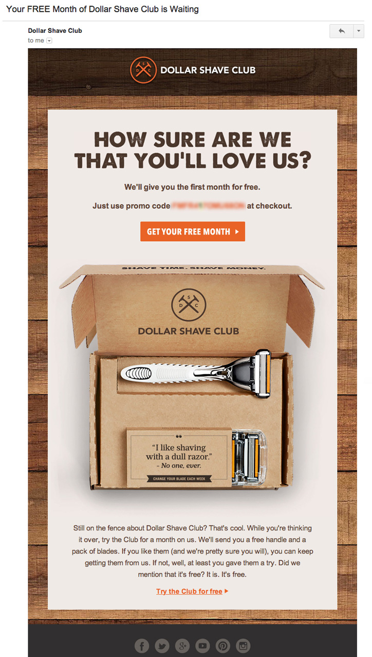
This is the most literal interpretation of the unboxing strategy that I could find. Dollar Shave Club actually includes a photo of an open box along with the products you can expect when you sign up.
This is a retention email sent to someone who starts the checkout process but abandons it before paying.
When Dollar Shave Club asks themselves, “What scared them away?” they clearly believe that fear of the unknown is high on the list. A Statista study found that “decided against buying” is the fifth most common reason that people abandon carts. In most other cases, they wanted the product but were scared away by something else.
This is a great example of easing anxiety with the simplest of methods: clarity.
Coursera: Putting a Face on the Product
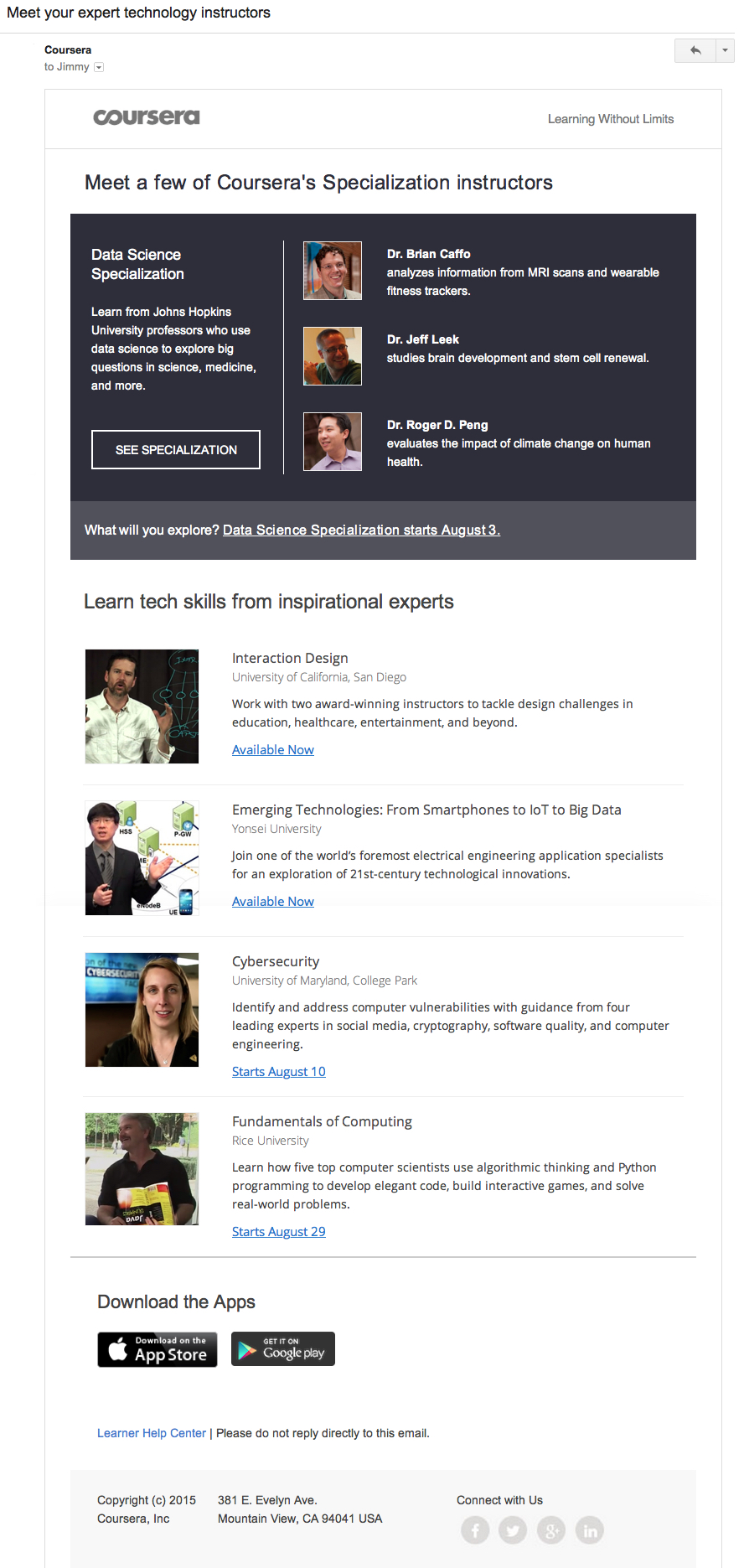
Online education is a bit of an abstract concept. Sure, it’s easy enough to understand that it’s like a classroom on the Internet, but what exactly does it look like? Who are the instructors? What can I expect to learn?
Coursera makes an effort to answers these questions and provide clarity for new students by showing them who is teaching their upcoming classes. There is so much context in this email. Not only can you see the instructors’ faces, you get a bit of information on their background, what their classes cover and when the classes start.
Also of note, this email is triggered to inactive students and the suggested classes are based on the interests those students indicated in the onboarding process.
Twitter: Visualizing the Future
No Twitter user will ever become active if they don’t connect with people. Following other users and having people follow you is the key to making the entire platform work.
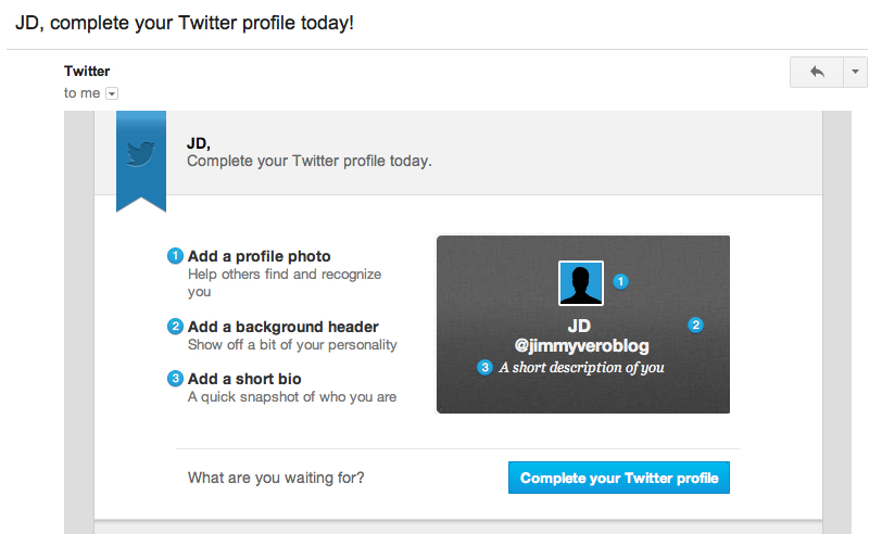
That means it’s extremely important to get new users up and running quickly. Completing a profile is one step in that direction and Twitter sends a series of emails like this one to ensure that happens.
Notice that his email, which uses the 1-2-3 method to match each task with a visual aid. It helps the new user understand why they should bother taking the steps and reduces the friction involved in the process.
Because the user can visualize their own profile before taking this action, it’s much more likely they will actually complete it.
Elevate: A Visual Product Update
It’s difficult to visualize a software product without using it.
This is why solving the users’ problem isn’t always enough. They need to be comfortable with your software in order to actually use it.
Elevate includes screenshots in nearly every email they send. They wisely frame the images on mobile phones since this is where users will actually interact with the software.
Just one email, like the one below, gives you a good sense of what to expect when you use Elevate. Now, imagine the cumulative effect of unboxing new features in every email. It’s profoundly different than simply explaining how the app works.

Gumroad: Unboxing with GIFs
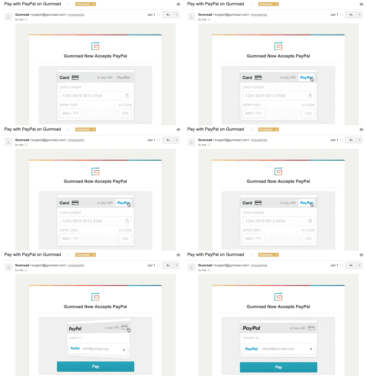
If an animation is needed to provide clarity and reduce anxiety, use GIFs.
GIFs work well in emails because, unlike videos, they are friendly in most email clients and play automatically.
Gumroad announced PayPal integration, then immediately shows what it looks like. Users don’t have to wonder if it’s useful or how it will work, they can just absorb this simple animation. It’s unboxing at it’s finest.
Check out post on product update emails to learn how to make email-friendly GIFs.
Have any questions about using the unboxing technique in your next campaign? Let us know in the comments.

