- All Posts
- /
- HTML Email Templates: A guide to getting started

HTML Email Templates: A guide to getting started
Messaging and Automation-
 Chris Hexton
-
Updated:Posted:
On this page
Email marketing is critical to any digital business. It’s an inexpensive marketing channel that allows us to personalize customer interactions in a way no other channel can match.
These factors all contribute to email’s high return on investment, as much as $40 for every $1 spent, for some brands. While that’s all well and good, HTML email templates in particular, are notoriously hard to create.
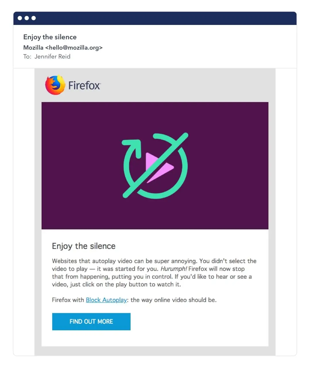
Take this email from Firefox as an example:
Looks pretty basic right? But here’s the code behind it.
See the Pen qBEKJpB by Iris (@irismtleung) on CodePen.
If this layout was displayed on the web, we could do the exact same thing with this simplified version:
See the Pen Mozilla Email on Web Example by Lenny Johnson (@Lennyjohnson) on CodePen.
The difference is stark. And if you’re used to creating websites for browsers, you’re probably shivering at the sight of all the inline styles and tables used for handling layout.
One way to escape this complexity is to just use plain text emails rather than HTML emails.
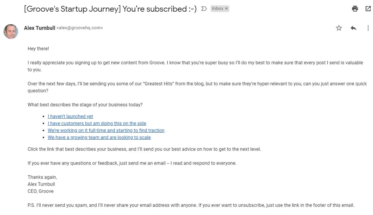
Plain text emails look like this:
They still convey the message but might not be the best fit for your brand. HTML emails give you more styling options, but they’re difficult to create.
The problem with creating HTML email templates
Emails are difficult to create because unlike the web, there are no fully accepted standards for how they should be styled.
And while the web is ruled by a few major browsers, email clients are numerous. According to Litmus, there are about 1,000 email clients around the world, roughly 250 mobile email apps, and a smaller number of desktop email apps.
When you send an email, you’re dealing with different ESPs, email clients, screen sizes and rendering engines. Together they add layers of complexity.
Here’s what Litmus has to say about email rendering:
"Every email that marketers send has approximately 15,000 potential renderings (and that’s using conservative math)." A whopping 15,000 different ways your email can be displayed!
Creating emails can be a big pain, but it doesn’t have to be. By the end of this article, you’ll know how to create great responsive emails without spending all your time on it.
How to create HTML Emails
When it comes to creating an HTML email, there are a number of routes you can choose, each with its own pros and cons.
Let’s go over them:
Using email design agencies
Just as some people go to web design agencies for a website, some businesses use email design agencies.
This makes sense if you’re a small team and don’t have the budget to get a full-time email designer on your team but you still want custom designs.
A few notable email design agencies are:
An email design agency will create and even design templates for you. Though it’s more expensive than other options on this list, it’s also one of the best ways to ensure that your emails display exactly the way you want them to.
Using an email design agency is also more time consuming as you’re outsourcing the work. So make sure to note a waiting period in your marketing calendar, as it will affect your timeline.
Using drag and drop email editors
By far the easiest option on the list. There are many drag and drop editors that can help you create great responsive emails.
The only downside is that you’re limited by how much you’ll be able to customize your emails. Still, if you’re creating standard email templates with simple layouts, drag and drop editors should be a great fit.
Take this email from Prisma as an example:
I was able to create something very similar with a drag and drop editor:
See the Pen Prisma email by Lenny Johnson (@Lennyjohnson) on CodePen.
A couple of great email drag and drop editors are:
Using pre designed html email templates
Pre designed email templates are like drag and drop editors in that they’re fast but your design style is limited to the template that you choose. But since there are thousands of templates to choose from online, your email can look like anything you want.
If you’re looking for HTML email templates, a few great places to start are:
Creating a template from scratch
Although requiring a steeper learning curve, this option gives you full control over every aspect of your email’s design. If you know HTML and CSS (or are interested in learning), then you already have the foundational skills needed to build HTML templates.
A couple of really great tutorials on the Internet to help you get started are:
A few really good frameworks that make the HTML template creation process easier:
Creating from scratch is time-consuming, but you won’t need to build a new one every time if your template is reusable.
Whatever method you use to create an HTML template, there are some best practices to keep in mind.
HTML email best practices
1. Use a preheader text: The preheader text is the little snippet, usually 50-100 characters, that you see beside the subject line of an email in most clients. It’s important as it can entice your subscribers to open the email. Here’s an email with a preheader text in Gmail:
Usually, email clients will grab the first bit of text in your content and use it as your preheader, but you can also specify what you want it to be.
Your email template or editor should have the option to include preheader text.
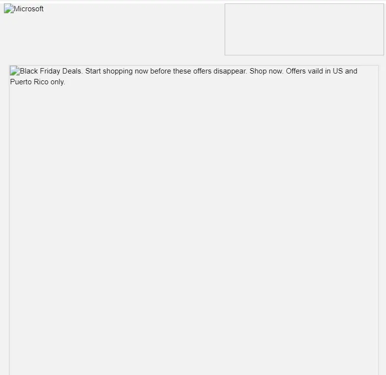
2. Images: Since images are blocked by default on some email clients, you should ensure that the reader can still understand the email without images. You should also add descriptive alt text to tell people what the email is about if they can’t see the images.
Like this email from Microsoft:
Even though the images aren’t visible, the reader can still get the gist.
In emails, images should be kept as small as possible, as this affects how quickly the content loads. An image size of 250kb or below is recommended.
The name of your image file also matters, but not for styling
purposes. It’s just that long, incomprehensible names may signal
spam filters in some clients. Make sure the names of your images
are short and relevant. For example:
Coffee-cup.jpg is a lot better than
                  image2-1539760546.jpg
3. Animation and videos: Animations in emails are made with GIF images since CSS animations are out of the question. And playing videos within an email is simply not supported by a lot of email clients, even by big ones like Gmail and Yahoo.
A simple way to counter this is to use an image with a play button in the center. The image is a link that, when clicked, opens a browser and plays the video.
Here’s an example from Platforma 2:
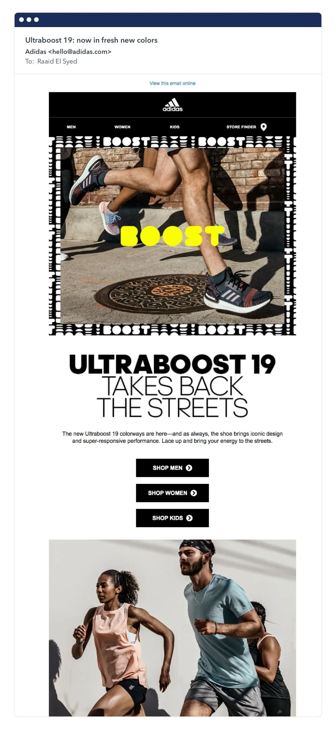
4. Buttons: Since images don’t load by default on some email clients, it’s best to not have an image as a button. Instead, you should use HTML buttons, also known as bulletproof buttons.
Since buttons drive your CTAs and are one of the most important elements in an email, don’t leave it’s rendering to chance.
For example, every button in this email from Adidas is a bulletproof button:
5. Supported tags: Since email lacks rigid standards, a lot of clients don’t support modern web technologies. So a general rule of thumb is that the older your code is, the better it’ll render in email clients.
This means:
- HTML 4 instead of HTML 5
- CSS 2 instead of CSS 3
- Tables instead of divs
It’s not that HTML 5 won’t render. It’s just that your email may have rendering problems on numerous email clients.
The same rule affects paragraphs and header tags, as they tend to render inconsistently across clients, so always check that these tags aren’t affecting your email’s appearance.
And while we’re on the subject of tags, it’s worth mentioning that you shouldn’t add more than one class to a tag as some clients don’t recognize multiple classes.
An alternative is to either incorporate multiple styles in a tag or use inline styling.
6. Minify your HTML: A minified version of your HTML email is one where all the extra spaces have been removed. This reduces the file size, allowing your emails to load faster.
Some email editors give you the option to minify your HTML directly, but if not, there are tools like Willpeavy and HTML minifier for that.
Testing your email
Testing can save you from rendering issues that might pop up. Thankfully, there are great tools that make testing emails across clients and devices a breeze.
The two most popular are Litmus and Email On Acid. Both are paid tools, but if email is a key part of your business then testing isn’t something to skimp on.
Using HTML email templates in Vero
If you’re a Vero customer, using an HTML template is as easy as clicking on the "Templates" icon in your dashboard.
Then click on "Create new template" and you can either import a file from your computer, or paste the code into the editor.
Then simply paste your code in the editor, hit save, and you now have a template you can work with.
You can read more about using HTML templates in Vero here.
Vero automatically generates a plain text version of your email for clients that don’t support HTML. To override the auto-generated version, you can add your own custom plain text.
Inspirational examples of email templates
Meetup
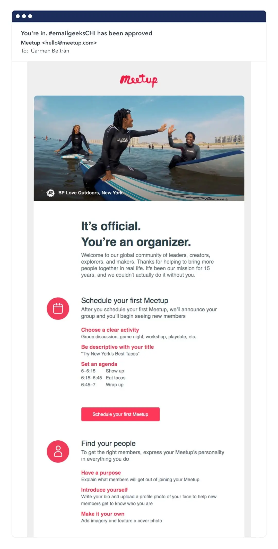
One of the benefits of using HTML emails is they help keep our messaging on brand. This email from Meetup uses the same logo and color scheme as their website:
GasBuddy
In this email, Gasbuddy shows that HTML emails are worth the effort.
How else can you structure data like this in an email?
HTML emails allow you to pull data from external data sources so you can create dynamic emails that change based on user data.
Bub Wardrobe
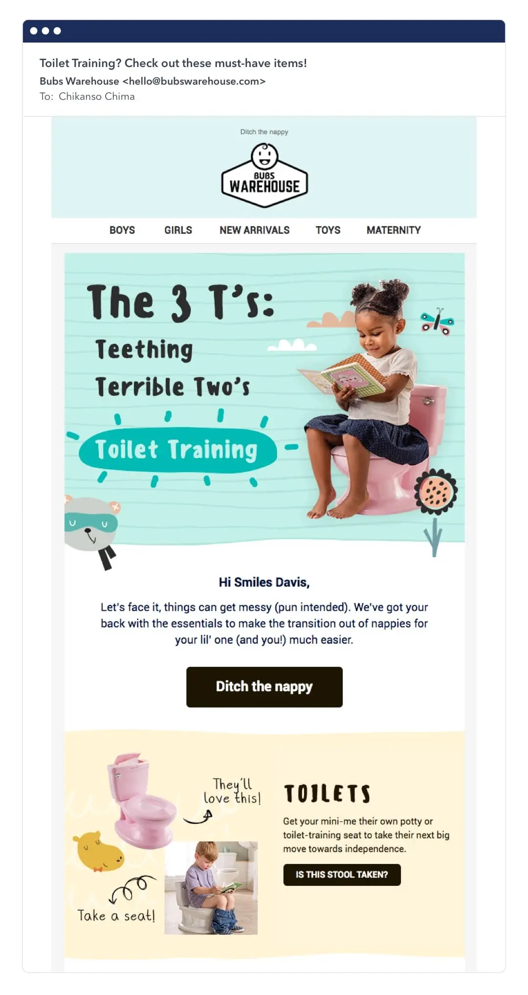
Marketing is part storytelling, and HTML emails give us the ability to make our stories more engaging and compelling to readers.
Take this email from Bubs warehouse as an example:
The email’s tone is playful and fits perfectly with the Bub’s Warehouse brand.
Images can make HTML emails more engaging, but if they’re not enabled on your receiver’s client – it can lead to a terrible experience.
To ensure this doesn’t happen, take image blocking into consideration. Here’s the email from Google with and without image blocking.
The alt text is descriptive enough that we still get a consistent experience either way.
The way forward
While creating HTML email templates can be a little complex, the benefits of email far outweigh their costs. To create HTML emails, you can use an existing template, an email design agency, or even a visual editor.
Whatever option you choose, you should always test across different clients and screen sizes to ensure your message is the same to all your customers.
Remember to prepare your HTML emails with image blocking in mind and like the companies in the examples above, look for ways to incorporate data, your brand’s style guides, as well as visually engaging content in your emails.
