- All Posts
- /
- Subscriber Emails
-
 Jimmy Daly
-
Updated:Posted:
On this page
[toc_chapter_title color=”green” number=”1″ title=”New Feature Emails”]
So you have a new feature and you want to tell people about it. How should you go about it?
Remember the golden rule of marketing: Sell the benefits, not the features.
500px
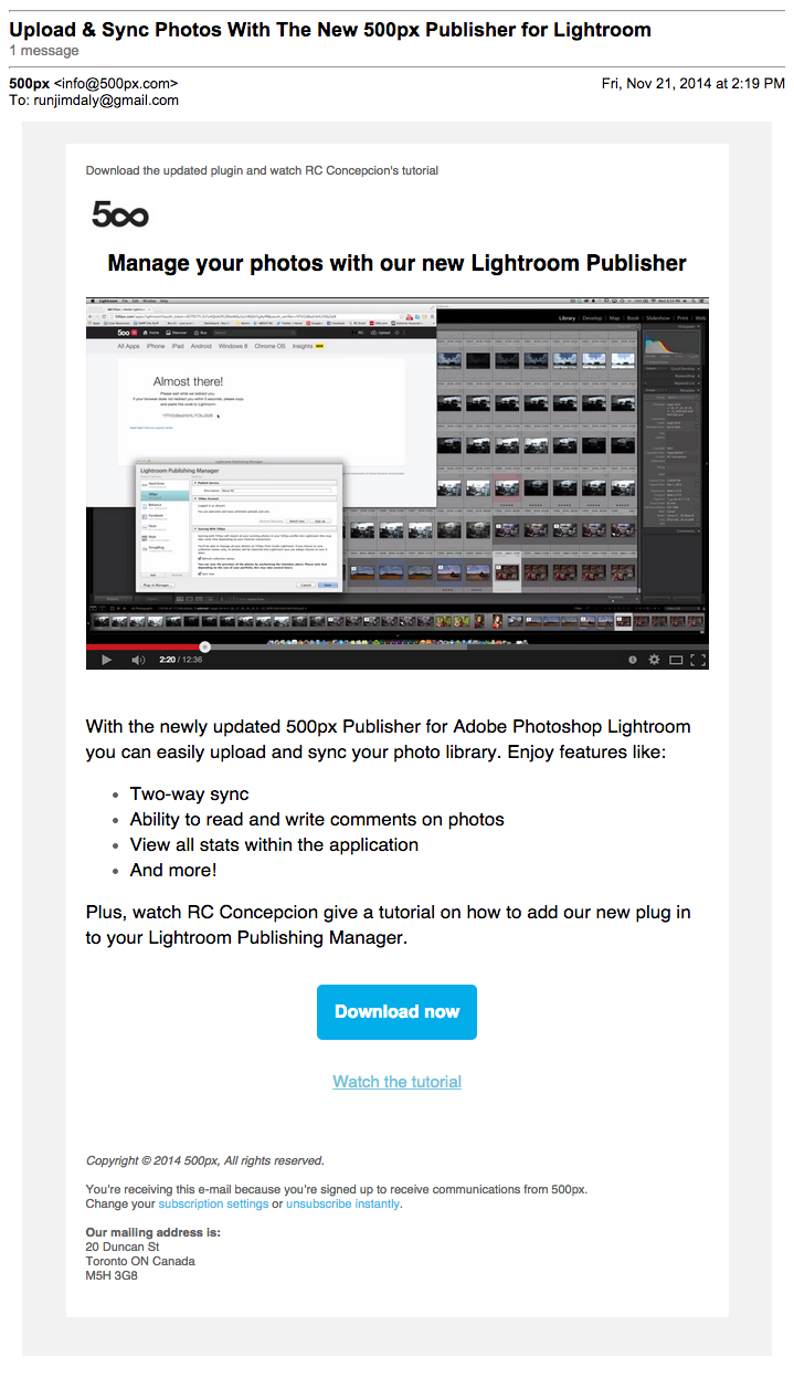
If you use Lightroom, you’ll immediately understand why this is a cool feature. 500px does a great job selling the new integration by keeping the copy very clear and concise. Bullet points are almost always a good way to relay information quickly.
The content does a nice job teeing up the call the action, which is bold and clear.
Feedly
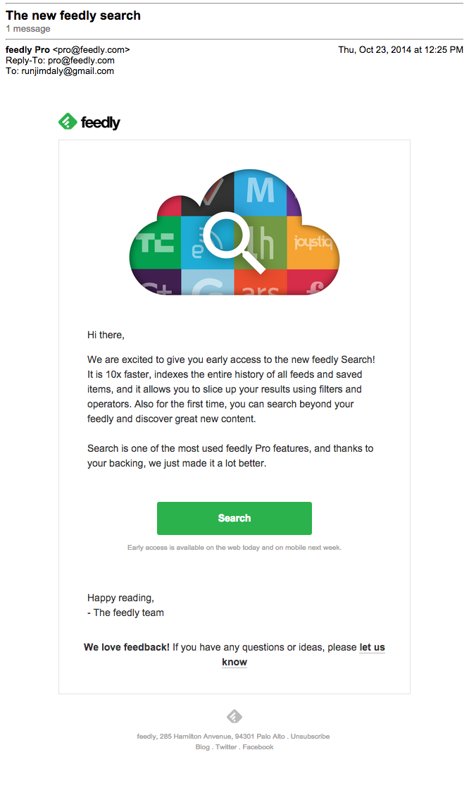
When you give users early access to an exciting feature, you make them feel like a VIP. Feedly makes me feel great, explains why the new feature will make my life better, then makes it obvious what I should do next: Search.
Foursquare
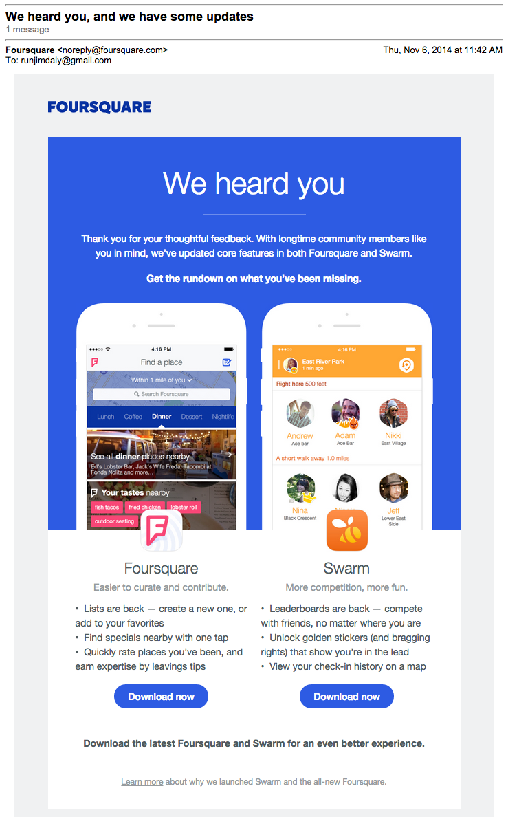
Foursquare attempted a difficult maneuver when they split their app into two separate apps. Because of their specific mission, the visuals in this email are important. They make it clear that there are two apps and you’ll need to download each individually to use them.
And just like 500px, they’ve used bullet points to communicate the benefits of each app.
[toc_chapter_title color=”green” number=”2″ title=”New Blog Post Emails”]
The first rule of a great blog post email is a great blog post. Assuming you’ve got that part down, use this email as an opportunity to get traction on new post.
Your blog subscribers are highly engaged – they signed up for blog updates after all – so don’t be shy with them. Use a conversational tone and don’t be afraid to ask for feedback or encourage them to try your product or service.
Buffer
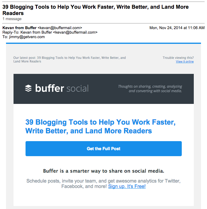
If you’re sending an email about a new blog post, it means that people have opted-in to receive the message. They want the content. So, like Buffer, don’t mess around. Just make it as easy as possible for the reader to move from their inbox to your site.
And always include a product mention, assuming the content is relevant to your product.
CoSchedule
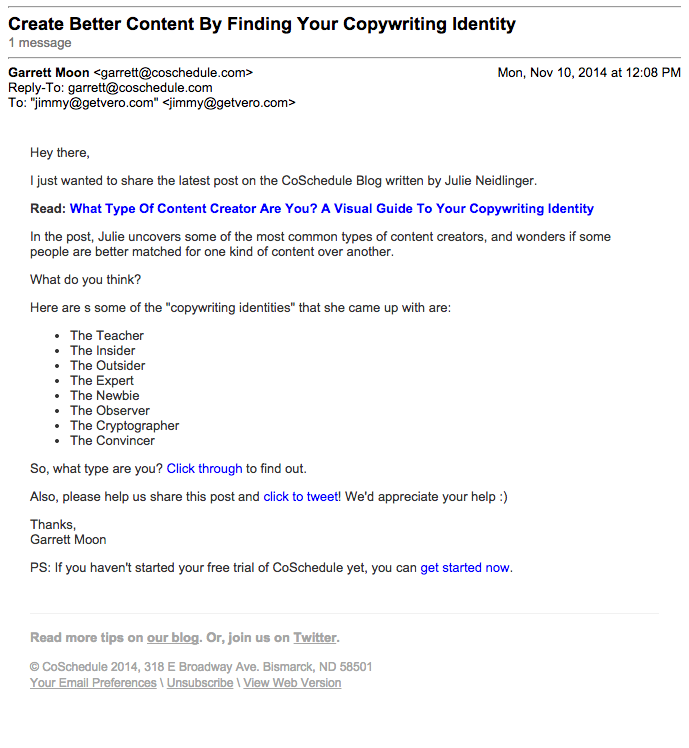
This is a different approach but Garrett from CoSchedule does a nice job providing context for the post. Without it, it may not be immediately obvious to the reader why they should click.
The conversational tone and plain-text format make this email feel very accessible.
Help Scout
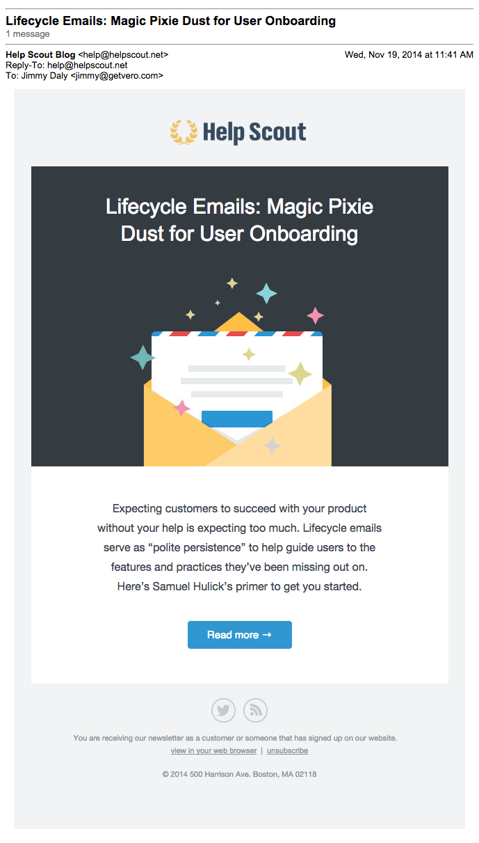
Help Scout invests in art for each post which they also use in their blog post emails. It’s a nice touch and it doesn’t distract from the real goal here … getting the reader to click that pretty blue button.
Shopify
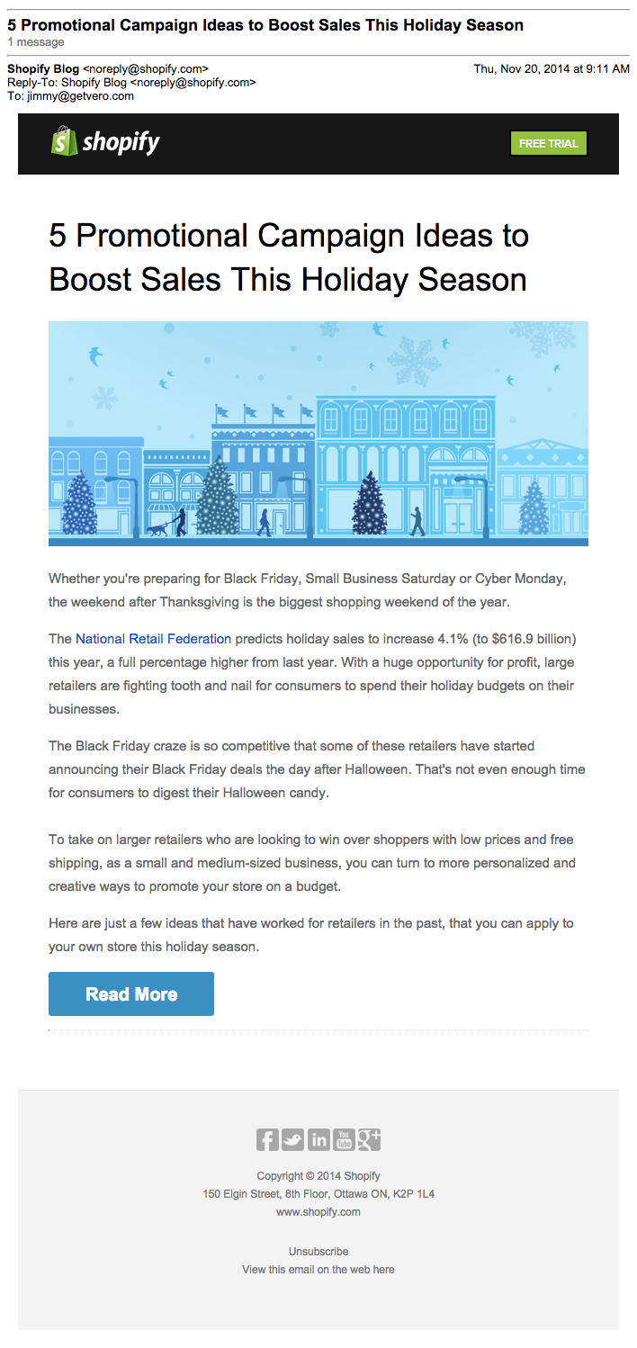
Shopify uses an excerpt of the post to draw readers in. Once the reader is hooked, they’re eager to click “Read More” and finish the post. This works as long as you write a great lede.
[toc_chapter_title color=”green” number=”3″ title=”Thank You Emails”]
You can thank people for just about anything. As you’ll see in the examples, saying “thank you” is a way to get someone’s attention. It makes the recipient feel good and it’s a chance to add value to your product or service. See what we mean.
Amazon
In addition to a receipt, Amazon sends this email when customers make their first purchase. The email shows the new customers all the things they can do with their Amazon account. It’s very useful for people who aren’t aware of everything Amazon does.
In addition, they use social proof – “we wanted to introduce you to some features that many customers find useful” – to validate that this email is helping, not selling.

ConversionLab
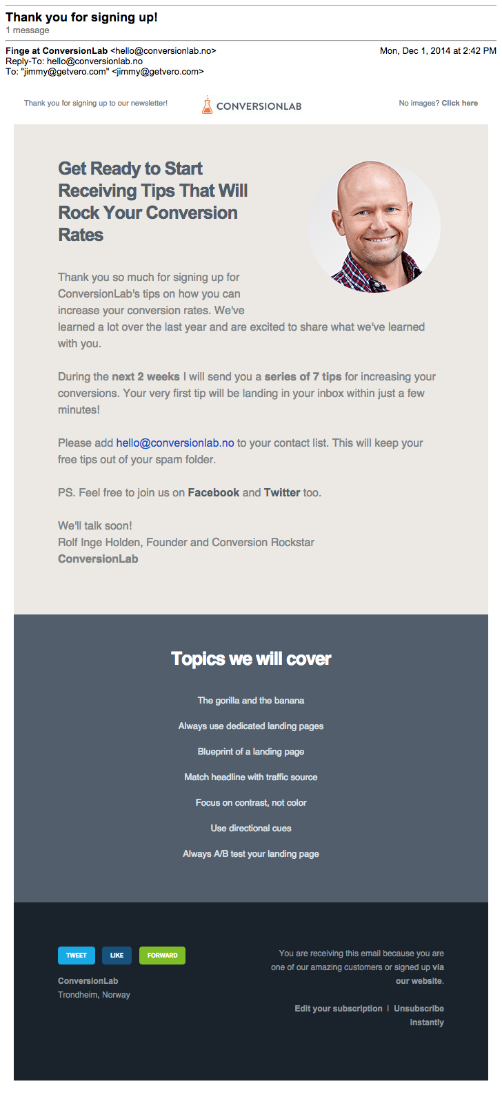
This is an alternative to the traditional welcome email. It’s more personal, and Rolf from ConversionLab uses this email to set expectations. Knowing how much email you’ll be sending is key to keeping your subscribers happy.
Evernote
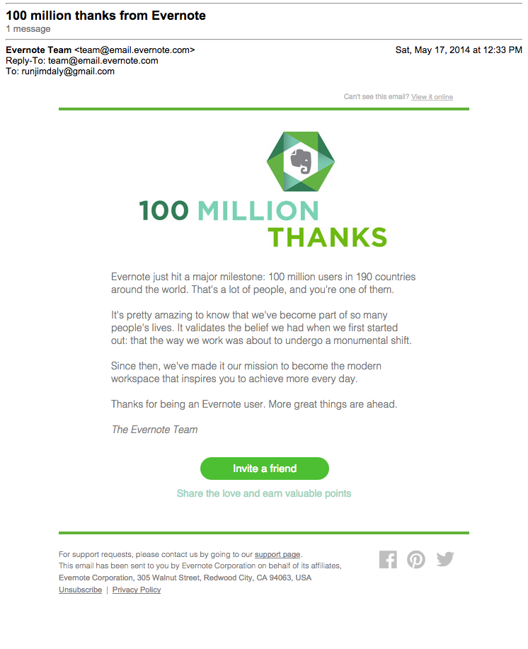
If you’re going to celebrate a big achievement – and 100 million users is definitely a big achievement – saying thanks is a good approach. After all, you don’t have a huge, profitable company without all those users.
Evernote is sending this email to 100 million people, so it’s safe to assume that their referral program is proven. Emailing at this scale is risky … be sure your call to action is the right one.
[toc_chapter_title color=”green” number=”4″ title=”Newsletter Emails”]
Newsletters are different than blog post emails in that they content links to multiple articles as well as other news and info. Curation is a great way to build an audience but the format matters less than the content. Here are a few ideas for presentation … just make sure the real focus is on great content.
IFTTT
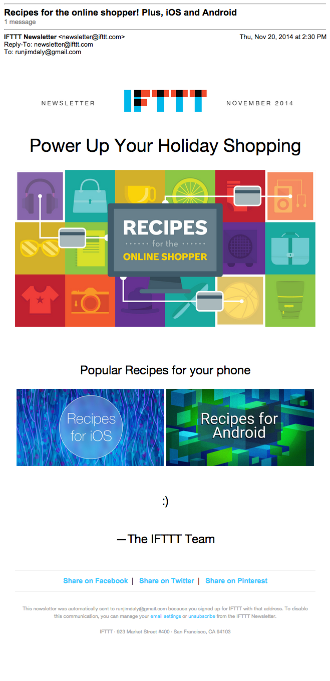
IFTTT’s emails are all very visual. This helps users understand how recipes work but it carries over to the rest of their marketing as well. This newsletter has almost no copy at all yet it’s still very effective.
BuzzFeed
It’s just so … BuzzFeed. And that’s a real compliment. It’s exactly what I expect from BuzzFeed. Plus, there are puppies. When in doubt, put puppy pictures in your newsletter.

Strava
Apps that track fitness often rely on inspiring quotes and stories to keep their users motivated. Motivated users will run or bike more and therefore have a greater need for the app.
It’s not a content-driven approach, rather a community-oriented one. Strava asks users to participate in a high-energy conversation about fitness instead of giving them more content.

[toc_chapter_title color=”green” number=”5″ title=”Roundup Emails”]
Roundup emails are different than newsletters because they mostly curate content not created by the publisher.
Moz
I’ve heard that getting featured in the Moz Top 10 sends enough traffic to crash many sites. The newsletter became popular because the content is always great, not because of the format or HTML template.
If you plan to send a newsletter, sign up for this one to get an idea of how the pros do it.

Digg
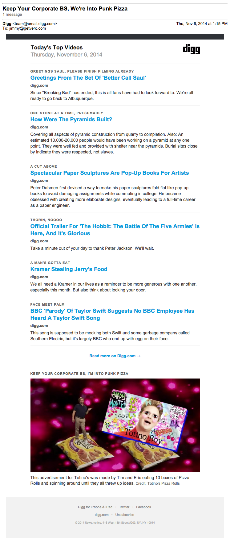
Digg is building a real business on curation and their newsletter is central to their mission. They send you away to keep you coming back. At first, it seems counterintuitive but once you see it in action, it makes perfect sense.
Product Hunt
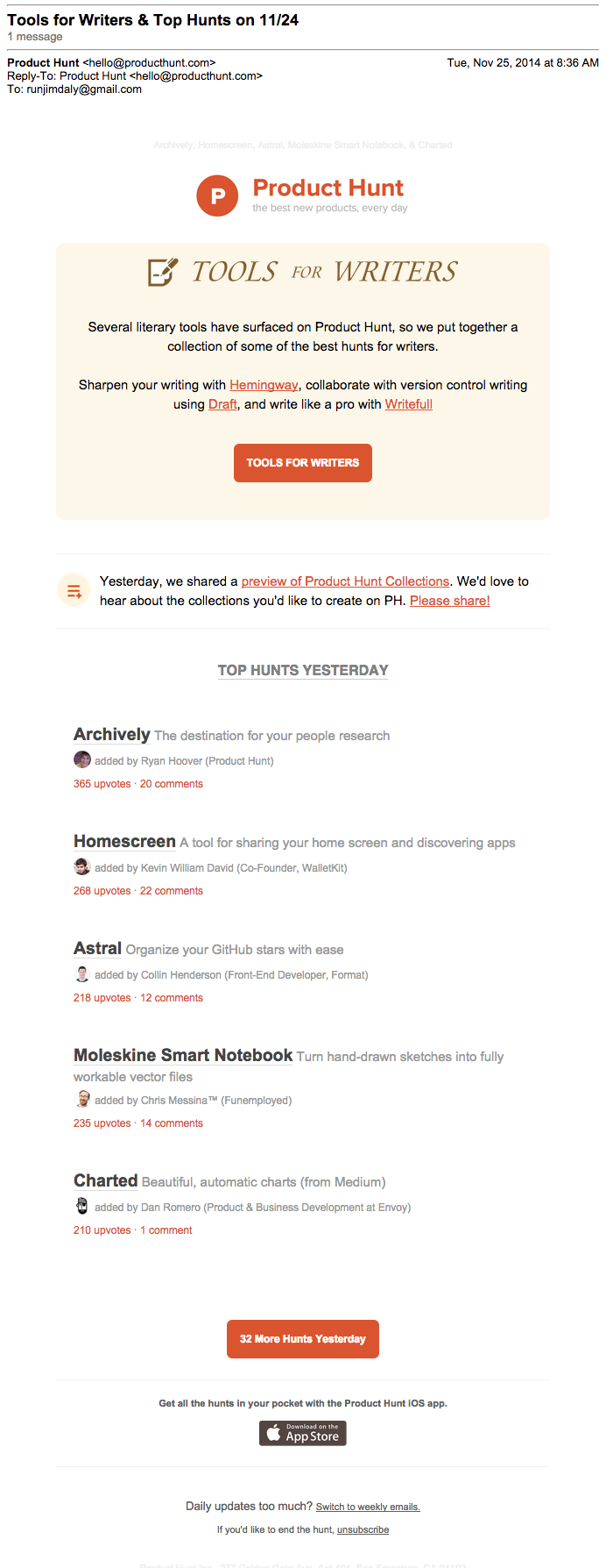
Oh, you’re addicted to Product Hunt’s emails too?
We’ve covered Product Hunt in-depth here but just know that these guys have figured out exactly how to send a great roundup.
[toc_chapter_title color=”green” number=”6″ title=”Course Emails”]
Course emails tend to be massive. And that’s okay if the reader is learning something. If including the content directly in the email doesn’t take away from the experience, they why ask people to click? Just give them exactly what they signed up for.
Email1k
Noah Kagan gives his Email1k students the option of reading lessons online but it’s identical to the emails. The content, call to action, images … it’s all the same. And it’s really, really good.

Mark’s Daily Apple
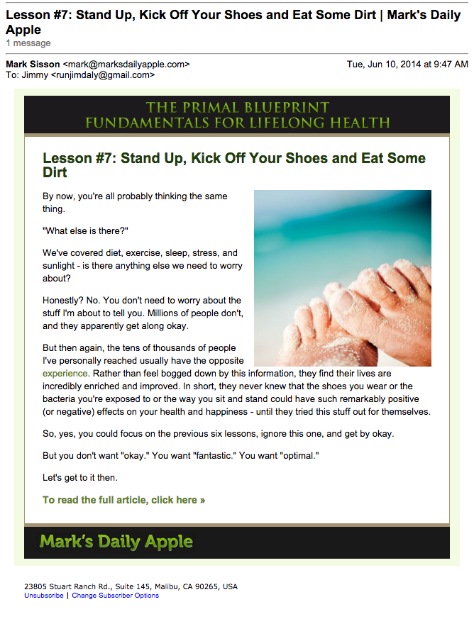
Mark Sisson uses his course emails as a teaser. The content of this email does a great job selling the lesson which readers can view in full on his website.
Whole30
This isn’t your average email. People pay money to be on this list. From experience, I can tell you it’s worth every penny.
Whole30 is a 30-day health food cleanse and it’s really hard. The daily emails keep you inspired and remind you why you’re doing this in the first place. The reason it’s so long is because you need a lot of motivation to refrain from sugar, gluten, dairy and alcohol for 30 days.

[toc_chapter_title color=”green” title=”Next steps”]
