- All Posts
- /
- Getting Email Subscribers
-
 Chris Hexton
-
Updated:Posted:
On this page
Knowing where and how to get email subscribers requires you to know the audience you’re targeting, and think about what you’ll ultimately send them.
Customer Personas
As with any marketing, you should spend time creating customer personas. A customer persona is a very clear image of the person you’re going to be selling to. How old are they? What sort of work do they do? What do they like? What do they hate? Where do they live? Where do they learn new skills?
Answering these sorts of questions is really important, particularly as you attract more subscribers.
As part of this process it is always useful to think about the Buyer Journey
The Buyer Journey describes the states a potential customer goes through from discovering your business to becoming a paying customer.
When it comes to email marketing, most online businesses target three distinct groups of customers, based direct on their place in the Buyers’ Journey.
- Readers / browsers: These are usually blog subscribers or casual visitors: they are not yet customers but are interested in your product(s).
- New customers or free trials: These are customers that are having their first experience with your business. They are not yet regular or long-term customers but they have started a free trial or made an initial purchase.
- Regular customers: These are customers that have purchased before and are now fully engaged with your business. These are the end game. Keeping them around is vital.
In this chapter we’ll focus on the first group: engaging more of the visitors to your website and turning these casual browsers into a subscriber so you can use email to turn them into new and loyal customers.
Ways To Collect Subscribers
The following tips are based on successful strategies that have helped businesses increase their subscribe rates by over 150% in just 4 weeks, improve their blog subscription 500% and continually lift the bar in terms of collecting customers’ emails.
Personalized Calls To Action
Most online businesses use forms to ask visitors for their email addresses.
If you’re running a blog these will often be at the end of each post. Regardless of where they are, one of the most basic and important steps to increasing your subscribers is to personalize the various calls to action your customers see.
As an example, you’d want to make the calls to action on your blog relate directly to the blog post the visitor is currently reading.
If you do not produce a varying stream of content then using this approach works because you’re giving them something specific and relevant.
Another way to look at this is to give your customers faith that they are going to get something useful. You need to gain their trust.
We’ve always loved this example from ASOS that not only shows how easy it can be to start segmenting your customers based on data you collect from them but gives the reader extra confidence that they will receive product updates just for them:
It’s nothing fancy but it helps assure the subscriber they’re going to get emails they want to receive.
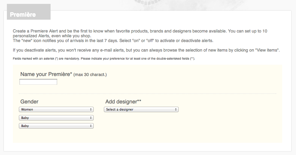
You could go even further and give your customers the option to get notifications based on specific properties or products they have selected. This sort of personalization is attractive to new subscribers as it gives them the comfort they’re going to be sent emails that matter to them. The following example is from European retailer Yoox. It’s an extremely detailed tool (on the complex end of the spectrum) but it certainly gives the customer trust that they’re going to get relevant updates!
Mini-surveys
Using on-site surveys is a great way to get your customers email address.
Qualaroo is a simple product that makes it easy to ask questions of visitors on your site and to be specific about it. Using their Nudge feature you can create a step-by-step survey that engages visitors and then asks for their email address.
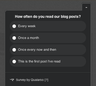
For example, you could ask your visitors a question like the above.
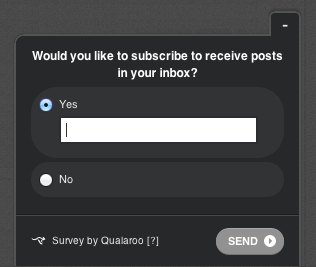
…and then send those customers that click the This is my first post to a subscribe form, like the above.
You will be surprised how well this works.
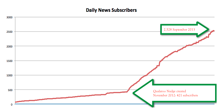
Jason Buzzell from the University of Alberta blogged about their success using a simple survey. The results were a 500% increase in subscribers in a single 12 month period. Here’s what that looks like:
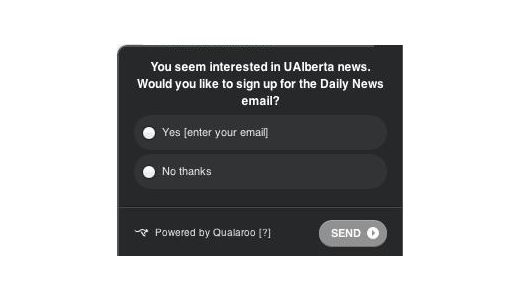
What is great about Jason’s approach is that they asked directly for the customers email, with nothing to sidetrack the customer:
As they say: ask and you shall receive!
Pop-up forms on relevant pages
Pop-ups usually cause a great divide: some people swear by them and others hate them.
As with all things, the truth is in the data and varies wildly by approach. There are lots of places where popups can help you increase your email subscribers without being intrusive.
Using analytics software you can identify pages on your site that have large amounts of traffic but minimal conversion. Interestingly, the homepage is often one such place. On these pages, popups can be very effective.
Your homepage is particularly interesting as it usually receives a considerable amount of traffic that is targeted (visitors have heard of you and either Googled your brand or clicked some promoted link). This can be a great place to target popups as a means to capture emails from those visitors that would otherwise bounce.
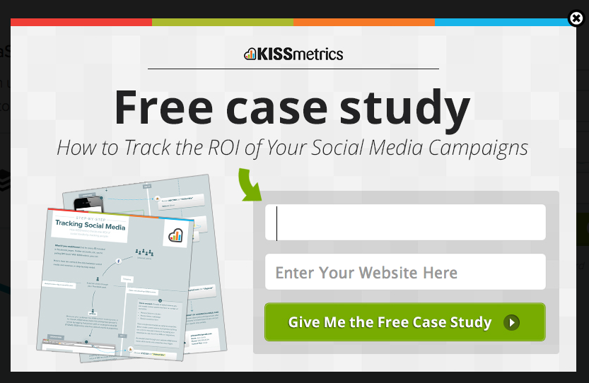
KISSmetrics show how it’s done by targeting visitors that are about to bounce with this popup form:
If you’re not using overlays you’re crazy. The secret to success is showing the overlay when the visitor is likely to engage: too much repetition or aggression results in a poor experience. Always think what’s in it for the visitor, and they’ll happily barter their info for something compelling .
Via Ryan Urban of BounceExchange.
Using popups effectively requires sophistication. There are two key elements to consider:
- When to trigger the popup: there are lots of tools such as PadiAct that give you tools to decide when and on what pages to trigger your popup. Immediately? After a certain time period? After a customer views a certain number of pages on your site? BounceExchange use a more powerful strategy and trigger popups to visitors that are about to leave your site. They do this by tracking customers mouse movements and behaviour and turning it into targeted popups. Smart.
- What to show in the popup: there are lots of ways to go about collecting your visitors’ email addresses in a popup but the most affective is, as always, to use a personalised call to action that relates to the page they are on and their position along the Buyers’ Journey. Test your popups to get the best results and ensure you aren’t angering your customers (fortunately, if you are, they’ll usually tell you).
Dedicated landing pages
Another tactic you should employ consistently is to use dedicated landing pages you can optimize and A/B test for focused conversions.
Dedicated resource pages have helped us grow our list from 0 to 30,000 subscribers in 12 months. Using dedicated landing pages is great for SEO and gives you a new means to convert readers into loyal subscribers.
Via Gregory Ciotti of HelpScout.
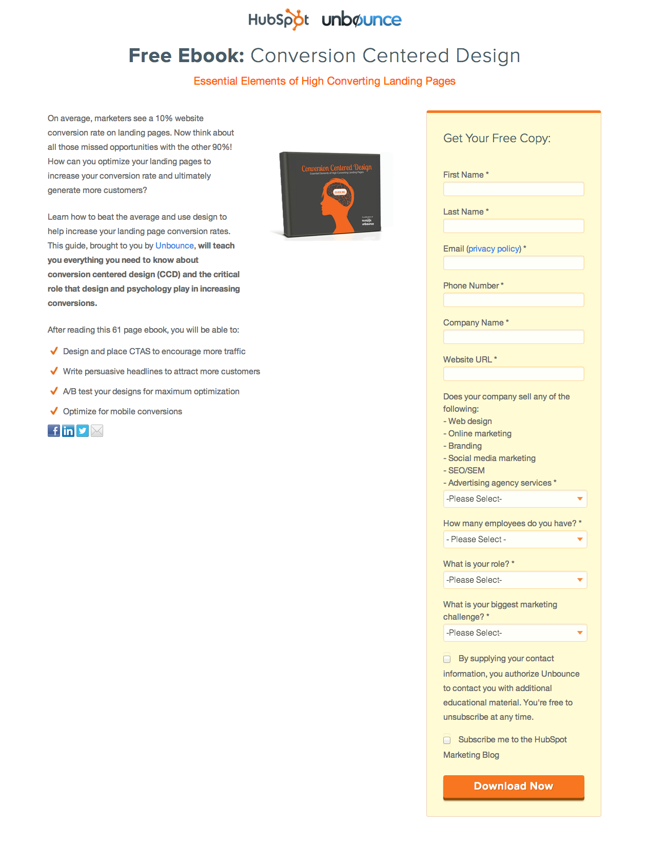
The following example comes from HubSpot and Unbounce who put together a resource called ”Conversion Centered Design”.
There is no distraction on this page. To get the free resource you have to fill out a subscribe form. By having a single focus it’s easy to A/B test and optimize a page like this for success. Rather than having too many elements or distracting the customer it’s all about getting their email in exchange for something of value.
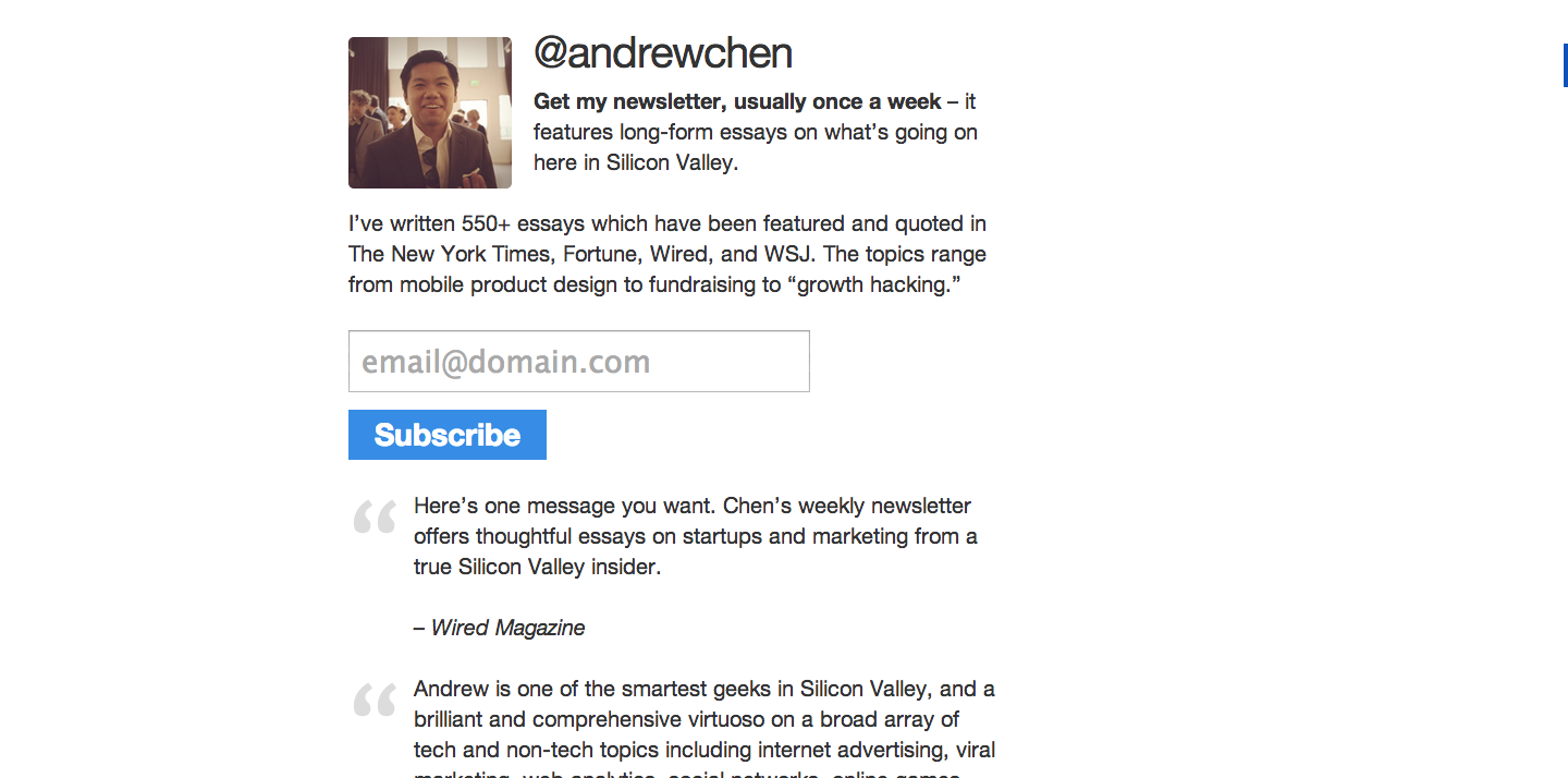
Andrew Chen and Gregory Ciotti use full-page interstitial popups to target customers that come directly to their blog home pages from Google.
By only using these full-page capture forms on their homepage (and not in front of other site content) they ensure they don’t frustrate regular, returning visitors by asking for their email each and every time but do maximize conversions.
If you head to his blog, you’ll get a landing page like this:
The theory here is that customers that are using branded search terms are likely to already have an attachment with your brand, so it’s a great opportunity to get their email. Andrew’s page is, again, singularly focused and does a ton of things right (such as huge amounts of social proof). It’s been a real success for Andrew.
Up until last year I never put a great deal of effort into collecting my readers’ email addresses. Since launching a dedicated email collection page as the landing page for my blog I’ve seen crazy, exponential growth. If a reader has searched out your blog there is no harm in asking for their email address!
Via Andrew Chen.
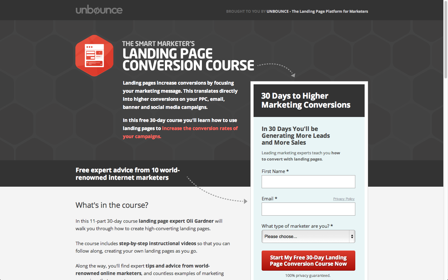
Similarly, Unbounce use this landing page to attract subscribers to their educational email course on landing page design.
They link to this page from all over the place: their blog sidebar (like a display advertisement), in their header of their homepage and via social media (to name a few).
This is a great example of a landing page that employs all the right tactics.
These sorts of landing pages can have an onsite conversion rate of up to 70%, which is massive! The team at KISSmetrics shared their success at increasing webinar attendance rates by 1000% using dedicated landing pages.
Irresistible content offered on a dedicated landing page that you can A/B test, is the winning formula for gaining subscribers. Through testing our ebook and webinar lead gen pages we improved our conversion rates by 150%, with these pages converting at of 60-70%. Add email marketing, and the impact of these new subscribers on our acquisition was game changing.
Via Georgiana Laudi of Unbounce.
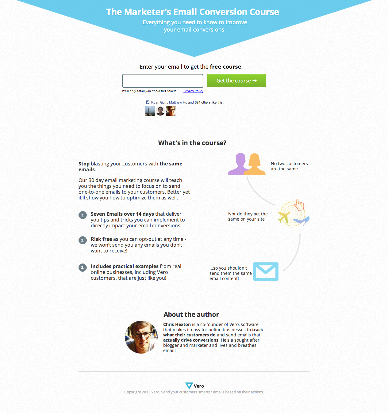
Vero’s own educational email course on email remarketing has a conversion rate of 42%:
That’s pretty impressive for a page that looks a little like this and testing the page is super easy:
Partner with others
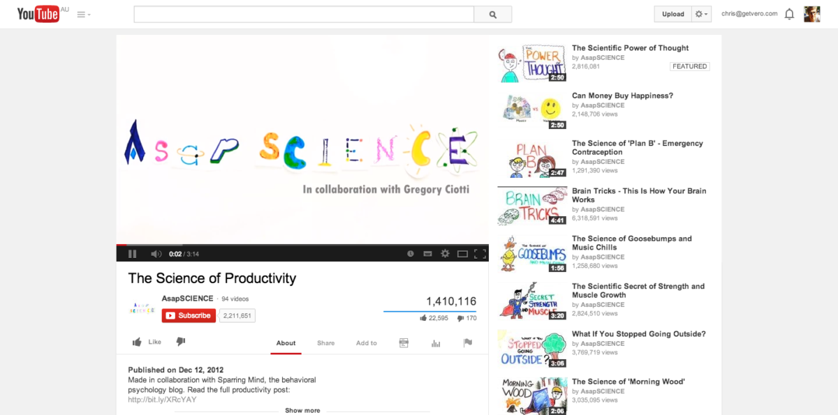
Gregory Ciotti shared how he partnered with YouTube channel “The Science of Productivity” to produce a video that linked back to his great blog SparringMind. This was extremely successful, garnering thousands of new subscribers in less than a week.
That is insane.
The strategy behind this was to partner with someone that had a relevant, but larger, audience and give them some great content in exchange for exposure.
This is a great way to grow your subscribers and audience quickly. By putting together the content for your partner, and doing much of the heavy lifting, you provide them with an amazing resource with very little effort and, in turn, you get lots of new exposure.
Alex at GrooveHQ has done an amazing job growing their SaaS blog quickly using this approach. Starting just five months ago with little to no subscribers they transformed their blog and now have over 7,000 highly targeted blog subscribers.
One of the most powerful drivers was Alex’s ability to reach out and connect with thought leaders in the SaaS industry. Fortunately, he’s blogged all about it, so head over and read the juicy details.
Connecting and building relationships with well-known bloggers is a great way to increase your exposure, especially when you’re starting out. Share quality content, help others and they’ll be willing to do the same.
Via Alex Turnbull of GrooveHQ.
How can you work with relevant partners to grow your audience faster?
With all these ideas on different ways to get subscribers with dedicated pages or across your site it’s time to start optimizing!
