- All Posts
- /
- How Grammarly Built an Email Product Users Love
How Grammarly Built an Email Product Users Love
News and Updates-
 Jimmy Daly
-
Updated:Posted:
On this page
Users gravitate towards utility wherever it exists. Email can deliver functionality and earn habitual engagement. It’s as important to product development as web, desktop, and mobile. Grammarly, today’s case study subject, understands exactly how to execute on this.
Their emails check all the boxes of a great product: useful, accessible, interesting and personalized. The inbox is no longer for marketing, it’s for experience.
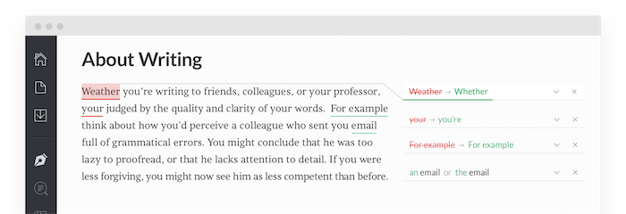
Millions of people rely on Grammarly to check their emails, social media updates and documents for grammatical errors.
On the surface, Grammarly is a simple browser extension. What most users don’t know is that it’s actually a carefully crafted product, supported by a growing team engineers, linguists and data scientists. Grammar is just the tip of the iceberg.
Drew Price, Grammarly’s head of product marketing, sees the product as part of the quantified self movement. Fitbit tracks your steps, Grammarly tracks your words. In each case, the goal is the same: track the data, identify trends and find ways to improve.
Whether you call yourself a writer or not, you spend plenty of time writing emails, updating social media sites, sending client-facing emails or drafting proposals.
The written word is a fundamental skill for all knowledge workers. Grammarly aims to make progress an enjoyable experience. “It’s genuinely fun, for the first time, to have insights on your writing habits,” says Price.
How Grammarly Built Its Product Lifecycle From Scratch
The market is right for self-tracking. At least 69 percent of Americans are already tracking a health indicator according to Pew Internet. As that market grows, more people are turning to technology for help collecting data. All evidence indicates that health tracking is just the beginning.
That said, turning a tedious task like writing into a lifestyle is a real challenge. To do it, Price and the team at Grammarly are tapping into the core principles of a stickiness: gamification, community, and a first-class experience.
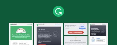
Because they track writing on multiple devices and platforms, email has become a central element to the Grammarly product. In fact, all of the data points – words written, errors made, and vocabulary used – are delivered in a concise weekly email.
“The weekly reports product is meant to be our bread and butter from an email perspective,” says Price. “It’s a retention/engagement hybrid.”

This email is sent to every Grammarly user, every Monday. It’s not meant to drive conversions – the email digest is an actual product feature.
How to Tell a Story with Data
Numbers can tell a story. It’s one of the reasons self-tracking has caught on. Increasing your daily step count can trigger weight loss and improved energy. Expanding your vocabulary and making fewer mistakes leads to better writing.
Grammarly adds context to the data they collect. They, for example, compare your data to other users. This fosters a sense of community and serves as social proof for new users.
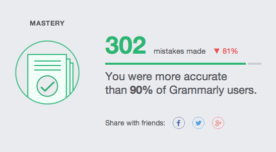
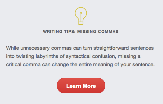
They pair hard numbers with targeted content. By dynamically inserting content based on activity, Grammarly provides a logical next step for users seeking to improve. If they notice you tend to forget commas, you’ll see content based on that topic.
Segmenting the Product for a Better Experience
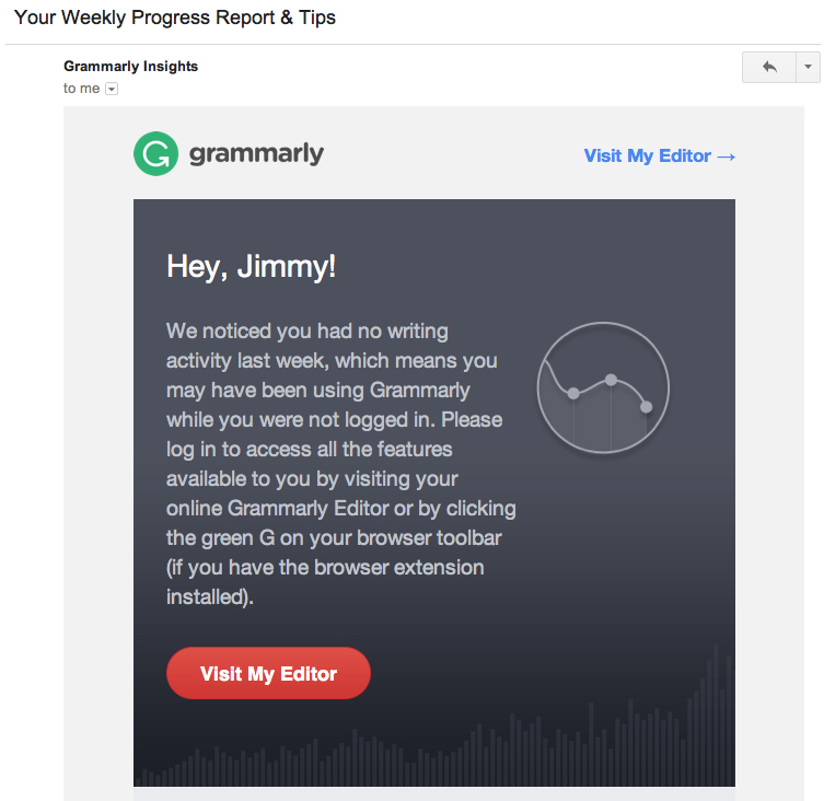
There are three versions of the weekly progress email. The one above is sent to users who tracked more than 100 words in the last week. Another is sent to users who tracked between one and 99 words. This group has obviously tested the product and needs either encouragement or technical support. A third version is sent to users who didn’t track any words. They address common reasons for churn and use a strong call to action to draw users back into the fold.
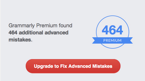
Within these segments are more segments. Grammarly breaks out active users with more than 100 mistakes in the last week for advanced targeting. These users stand to benefit from the premium product, so they see different copy and calls to action.
In addition to the weekly report, Grammarly uses email to onboard new users, promote the premium product and update blog readers. To avoid overlap with autoresponders and behavioral campaigns, they always send the weekly report on Monday. Engagement and retention campaigns are always prioritized above promotional email. This can mean heavy segmenting, but it’s worth the effort to keep happy users engaged.
“The last thing I want to do is frustrate people who use and love the product,” says Price.
Grammarly’s Email as Product, Experience as Marketing
With all the attention to detail in the reports, you might expect that Grammarly’s other emails are equally exceptional. You’d be right.
Most users discover Grammarly browser extension first, so the team has mapped most of the campaigns around that organic journey.
They also offer a text editor, but Price and his team have found that the extension is the stickiest product. You’ll notice an emphasis on the extension in the emails. Retention is key. If users love the extension, they are much more likely to explore the text editor and eventually upgrade.
As a result of the product layers, Grammarly has created lifecycle campaigns to match the different ways users discover and use the products. Price is quick to emphasize that “there is no one-size-fits-all approach.” Each campaign is created with a single goal in mind, based on the attributes of the target users.
Take their welcome email for example. Users who initially register for the browser extension receive a different email than those who sign up only for the text editor.
(Here’s the welcome email for browser extension users. And here’s the welcome email for text editor users.)
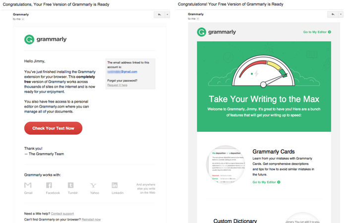
Each email is the first in a series that takes users through the respective product. The campaigns are course-correction for users-they either address inactivity or build on momentum.
“If you go through our funnel one time and decline the prompt to install the browser extension, we don’t send a traditional welcome email,” says Price. “We focus on encouraging that user to re-think installing our extension.”
That email (shown below) is general, but the campaign gets more specific if the user doesn’t take action.
“After the initial inactivity email, we try to get very specific,” says Price. “One email is around privacy concerns because we’ve done surveys and know that some people worry about what we’re doing with their data. Another focuses on extra features, like our thesaurus.”
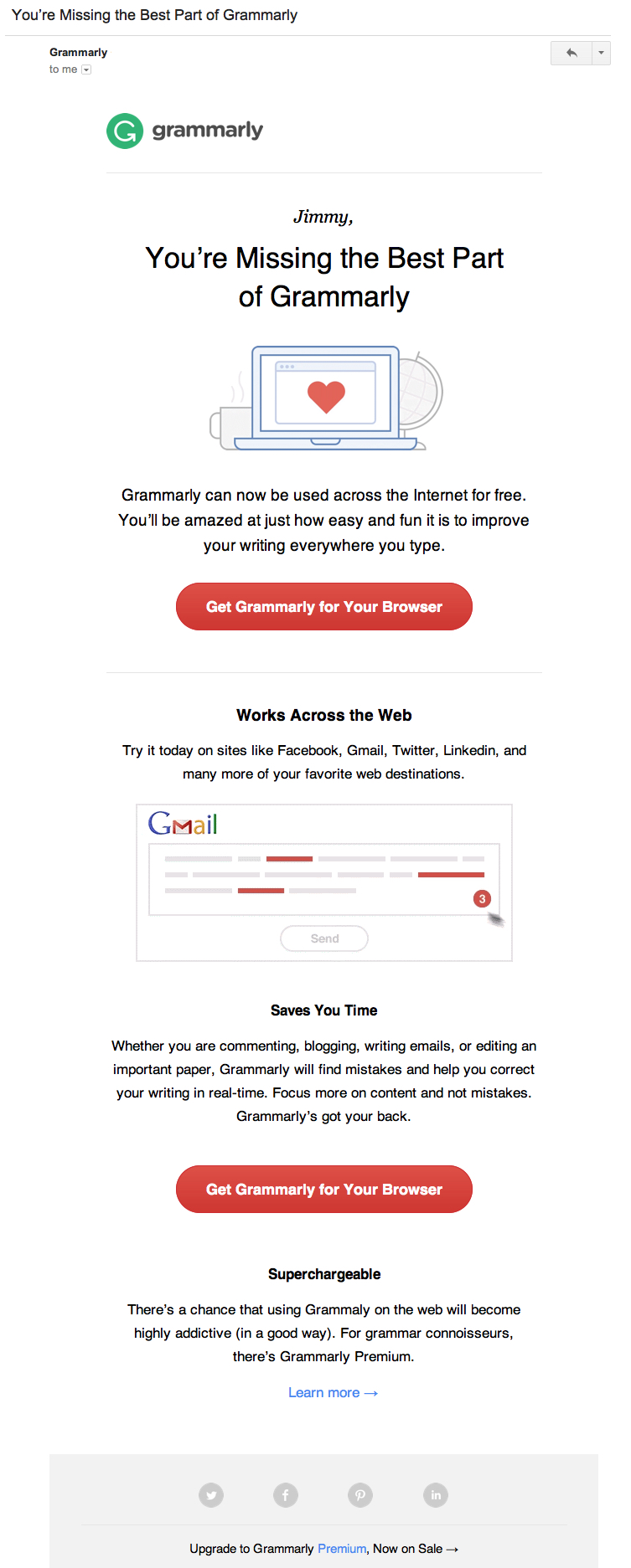
Technical issues can also be a challenge for new users. They must, for example, be logged-in to track their writing over time. The longer inactivity persists, the more Grammarly digs into the roadblocks. It is paramount that users overcome this initial hurdle.
“Getting that first product install is the main KPI for the abandoned install stream. It’s not about converting you to premium, it’s about just getting you to install and use our product for the first time. That’s the main goal.”
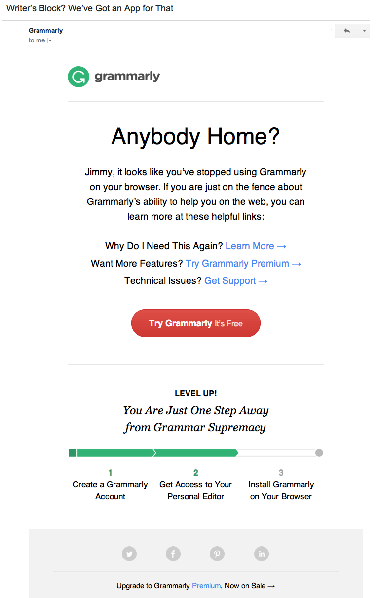
These emails are successful because Grammarly finds the right moment, not time, to send them. But they also employ some sophisticated copywriting and design that leaves the user feeling unsatisfied.
The Perfect Email: Copywriting, Design and Data
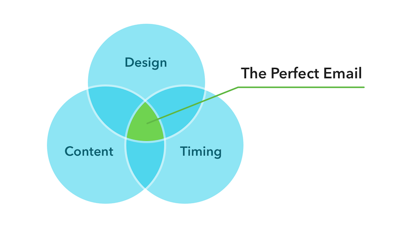
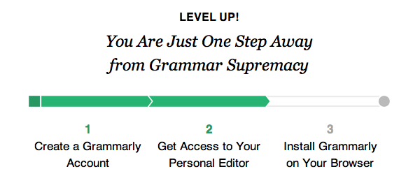
The Zeigarnik Effect – “the tendency to experience intrusive thoughts about an objective that was once pursued and left incomplete” – is no gimmick. It’s a tried-and-true gamification strategy with plenty of science to support its efficacy.
Here’s how it works in marketing and product design: Progress bars show users there is more work to do. That creates a tension that users can only relieve by completing the task.
If you’ve ever updated the apps on your phone just to get rid of those red numbers, you understand how it feels.
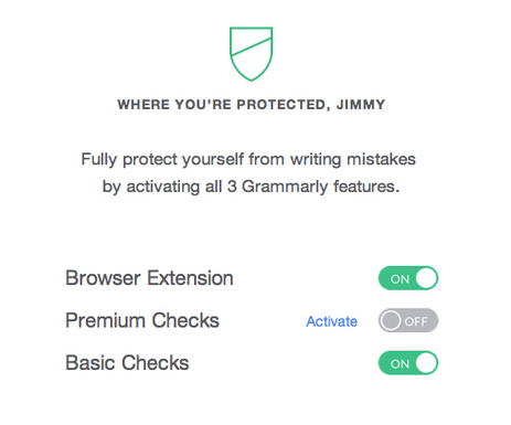
Grammarly uses copy and images to reward users for their progress and remind them that their work isn’t finished. The result is a nagging feeling of incompleteness. Upgrading is the only way to satisfy the feeling.
Building Relationships and Trust with Email
“Think long-term. Think of creating an optimal relationship.”
Those are Drew Price’s words of advice for email marketers. It’s easy to say and hard to execute.
In general, Grammarly’s emails are interesting and personalized. But there is one email that really speaks to how seriously Grammarly takes Price’s advice.

Instead of adding every new user to the newsletter list – a common, albeit frustrating, practice – they ask users if they’d like to receive updates from the company blog.
This is subtle but important. If Grammarly added new users to the newsletter by default, they’d water down their own product by adding noise to the inbox. The opt-in request provides a cleaner experience and fosters a trusting relationship in the process.
There’s nothing easy about putting together exceptional email campaigns. The initial creation process required contributions from six people, including two designers, a handful of developers and the company’s co-founder. A team of three handles the maintenance and testing of the existing campaigns. As Price says, “creating a great customer experience is never done.”
“There aren’t many one-size-fits-all best practices. It’s about figuring out the relationship you want to have with your customers, then working backward. Be surgical.”

