- All Posts
- /
- Email newsletters: Why they’re effective and how to create your own

Email newsletters: Why they’re effective and how to create your own
Messaging and Automation-
 Chris Hexton
-
Updated:Posted:
On this page
99% of consumers check their email every day, so email newsletters are a way to get your product or service in front of customers regularly. Time to fire off some emails, right?
Except the “if we build it, they will come” mentality doesn’t cut it anymore. Inboxes are crowded with other email marketers vying for the attention of the customer.
And consumers are experiencing email fatigue on their end as well, spending approximately 28% of the average work week answering emails. So instead of hoping that the ideal customer will simply see and engage with any email you send, you’ll have to be more strategic.
Which is why we’ve created this starter guide that walks you through the basics of what email newsletters are, why they’re important, and how to create your own. We’ll also include examples of campaigns that we think are great, so you can get inspired.
What is an email newsletter?
Whether it’s featuring a product update, new blog posts, or actionable tips related to the industry you work in – email newsletters serve to inform and engage.
Email newsletters come in many different shapes and sizes. They have varied layouts and designs, and can serve any purpose under the sun. They’re as customizable as you’d like them to be.
Some examples of common email newsletter types are:
- Invitations – “come join us for our webinar this Thursday!”
- Reader’s Digest – “read the latest articles we’ve published!”
- Product update – “we’ve just rolled out a new feature!”
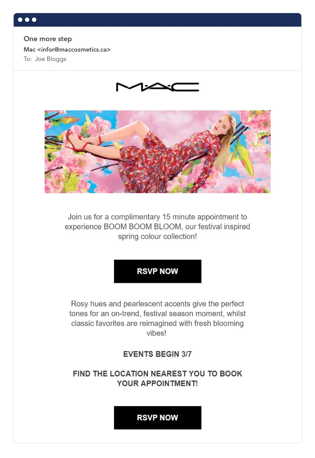
Below is an example from Mac, inviting customers in for a 15-minute complimentary appointment to try out their new spring releases.
Besides the external, newsletters are also used for internal communication, working especially well for large organizations.
For example, company leadership can use a newsletter to communicate new policy changes, or give recognition to top-performing employees.
Now that we know what a newsletter is, let’s look into their pros and cons.
Are email newsletters effective?
59% of respondents say that email newsletters sway their buying decisions. And more than 50% of respondents say they check their emails more than 10 times a day, and that it’s their preferred channel to receive communications from brands.
There are two primary reasons that email newsletters are such an effective channel:
- They’re a cost effective way to reach out to your customers,
- You can customize them based on your brand personality, but also on your customer’s gender, location, past purchases and other information they’ve shared.
The below example from GasBuddy is a great way to personalize an email by using dynamic content.
Whilst they’re cost effective and targeted, as mentioned above, just sending an email is no longer enough to make it effective. It takes work to ensure your newsletters reach their goal.
What makes a good email newsletter?
1. Newsletter content balanced between 90% educational, and 10% promotional.
Even if you have a very engaged audience, it’s important to remember that the email newsletter doesn’t exist only to sell. Typically, your customers have subscribed to hear news or learn from you.
While it is an opportunity for your audience to interact with your brand, it shouldn’t be about pushing your products and services. So when sending out an email newsletter, create a balance in favor of educational content.
You never want anything to feel like a hard sell. Over time, the results will speak for themselves.
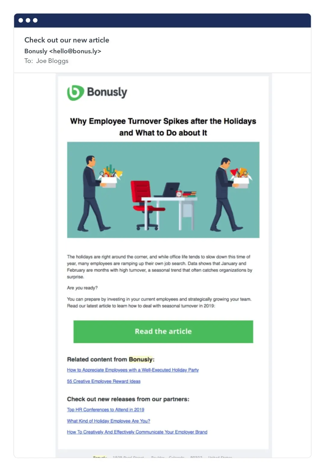
The below example from Bonusly is a balanced email, with only a couple paragraphs of copy – paired with colorful buttons and links to helpful content.
2. Minimalism when it comes to design and copy
It may be tempting to incorporate a myriad of colors and shapes into your newsletter design, but it might make more sense to save those for your website.
As 70% of people are reading their emails on their mobile devices, your email newsletters should be first and foremost easy to read. Concise copy and a healthy dose of white space in your layout are paramount.
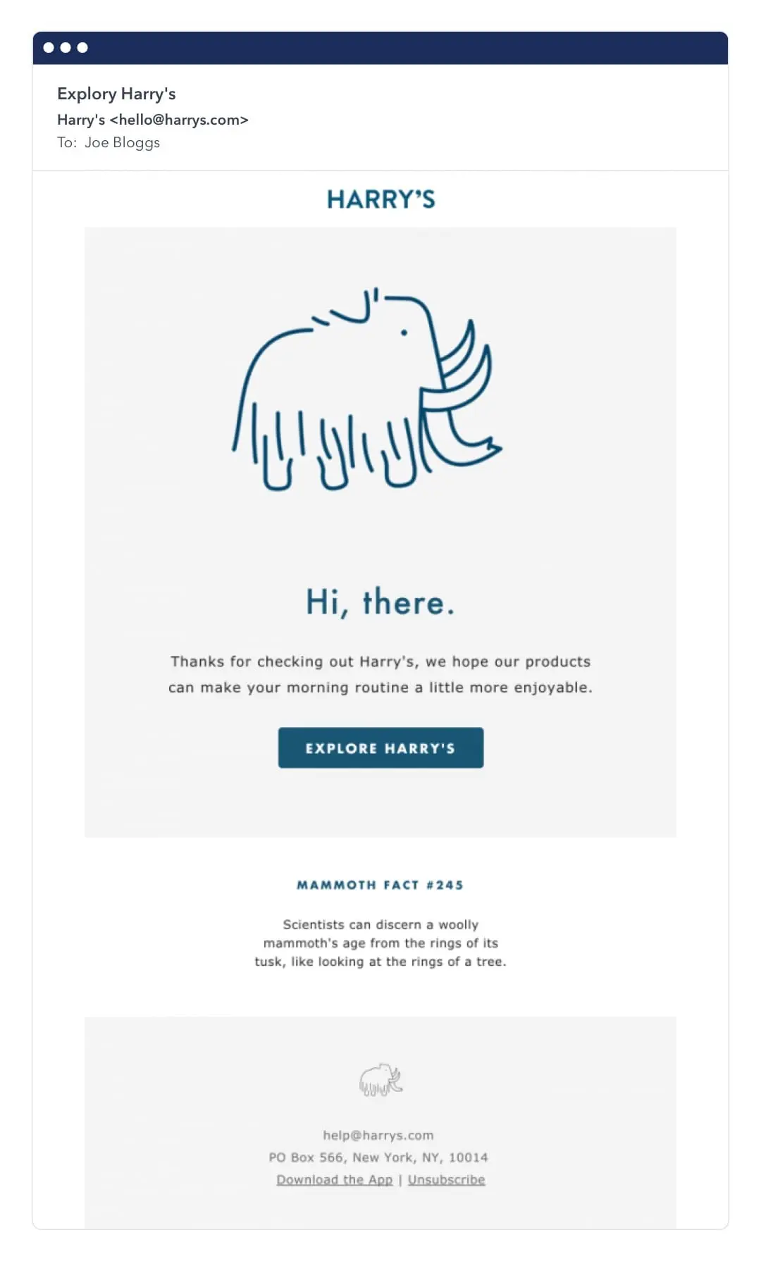
The below email from Harry’s is as minimalist as it gets in terms of design. It only contains a woolly mammoth character on a monochromatic color palette.
3. Content that is personalized towards your audience
There are a number of ways to personalize your emails, including segmenting your email lists, including dynamic data such as the customer’s first name in the email, and reaching out at the right time.
The most effective way to truly personalize your emails, in our opinion, is with dynamic content. Dynamic content is web-based content that changes based on everything from a user’s interests to their gender, purchase history, and even geography.
Dynamic content makes for a truly custom experience resulting in emails that your subscribers will feel are more tailored to their wants and needs. The below email from Ritual is an example of dynamic content done well.
4. Easy unsubscribes
Believe it or not, creating a user-friendly unsubscription process is key to maintaining an active and engaged subscriber list.
It’s like throwing a party and keeping the door unlocked so guests, who are no longer enjoying themselves, are free to go.
After all, unfriendly unsubscribe processes are one of the main reasons that a user will file a spam complaint which is detrimental to your email deliverability and sender reputation. So make your unsubscribe process easy, clear, and concise.
The below example from Refinery29 offers a few preferences that are clear and friendly, in hopes of retaining the subscriber.
5. Test it out
Beyond creating great content packaged with minimal design, a good email newsletter is one that has been tested multiple times.
A/B testing removes all the guesswork and replaces it with data, and it’s an approach we recommend. With a tried and tested email newsletter, you’ll know exactly what your audience enjoys engaging with.
Here are a few elements to test in your emails:
- Subject lines – This is one of the first things your subscribers see when your email shows up in their inbox. So fine tuning your subject line is key to improving your open rate.
- CTA copy and design – It all depends on your subscribers. Do they tend to click on bright buttons with humorous copy? Or do they prefer something more laid back and muted?
- From address – Like the subject, this also has prime real estate in a subscriber’s inbox.From addresses to test include: your business name, the name of your founder/CEO, name of one of your department heads, or the name of a customer-facing person in your company.
How to create a newsletter
Now that you’re familiar with what makes a winning newsletter, here’s a checklist of the things to think through when creating your own. From the ground up.
Step 1. Determine a goal for your newsletter
Before you begin crafting the design and copy for your newsletter, you should assess what your goals are. After all, your goals are the compass on your maiden email newsletter voyage.
To do this, start by asking a few questions to consider how your newsletter fits into your overall content marketing strategy:
- Is the newsletter meant to generate leads?
- Is it primarily meant to send more traffic to your website?
- Is the newsletter here to help distribute your blog posts?
Nailing down the purpose of your newsletter is key to shaping the content you want to create, and it’ll also immediately inform the conversion activity you’ll want to track.
Step 2. Determine your audience
You now know what you’d like to accomplish with your newsletter, but who is it for? Most companies have more than one customer segment, and one size certainly doesn’t fit all.
Let’s say your email goal is to re-engage existing customers into buying more, and you’re including their previous purchases in the email as a reminder.
Emails like this definitely don’t belong in the inbox of your freshly-acquired leads.
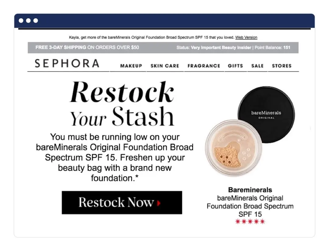
The below Sephora example shows a way to leverage previous purchases to get customers to restock on a product. This kind of email, of course, wouldn’t work for a subscriber that has yet to make a purchase.
If you’ve understood your goal(s) and defined your email’s target audience you’re ready to get rolling on your design.
Step 3. Design your template
When selecting, or designing your template – you may be tempted to use something elaborate and eye-catching.
To reiterate, your email newsletter should aim to make it easy for subscribers to skim, read, and also interact with the links in your email. A flashy email design might distract from the true goals of your newsletter.
As one of your primary goals is always to create an enjoyable reading experience, it’s usually good to remember that white space will help your cause. It gives your copy some breathing room and improves readability.
Some design tips include:
- Make sure your designs are mobile-first
- Write copy that’s short, sweet, and concise
- Create visual hierarchy, frame content with headers and footers
- Create mood with purposeful color choices
- Simplify your font choices – readability should be a priority
- Use high-res, stunning imagery
- Test your designs with something like Litmus
Step 4. Begin putting together your content
Your newsletter’s goal will also dictate your content.
If your primary goal is to use your email newsletter to distribute blog content, the major focus of the email, and therefore your copy and content, will be your newly published posts.
If you’re sharing a product update, your content may be comprised of the latest highlights from your release notes.
Or perhaps you’d like to send more traffic to your website or social media accounts, you might be gathering content from older blog posts, your help docs pages, Instagram feed, or any content that you’ve used for lead generation purposes.
Here are some quick tips for email content writing:
- Use actionable language in the subject line to increase conversions, such as “buy, download, reserve, etc.)
- Actionable language should also be used in your call-to-action too.
- Use personalization when you can. Dynamic content is a great way to create custom subscriber experiences.
- Make sure your subject line and email content are aligned. If your subject line enticed subscribers to open, they should get what they’re looking for in your email.
- Write your email in the “second person,” using “you,” you’re,” and “yours.” This angles the content towards the reader.
- Be short, sweet, and concise. Remember that your subscribers are bombarded by emails every day in their inbox, and won’t have time to read longform.
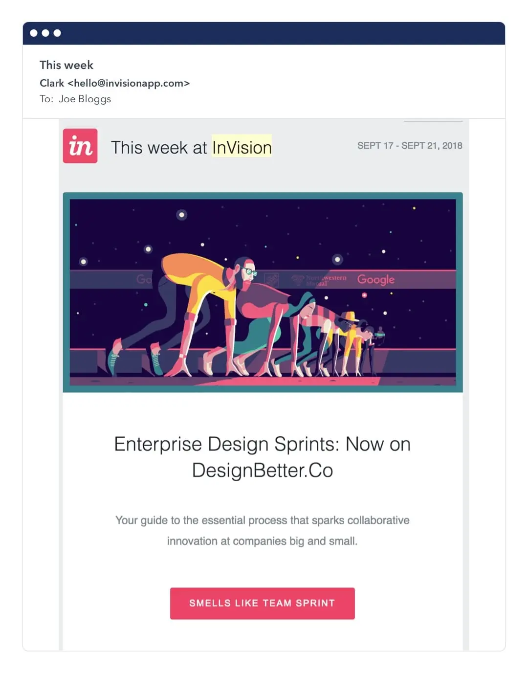
The below example from InVision is the definition of short and sweet, using illustrations and clever CTAs in place of big blocks of text.
Once you’ve completed your content, have a team member do a round of proofreading before you send it out.
Unlike a blog post, you won’t be able to go back into all those emails you just sent to fix a typo. Also, set the size of your email newsletter. Your subscribers will open your newsletter on a variety of devices, on a smartphone, tablet, or desktop.
So how do you know which size or resolution to go with? Most email service providers will default email newsletter sizes at 600px in width, so make sure that your email newsletter design fits into that specification.
As for the height (or length) of your newsletter, you can go as long as you’d like – but research shows that keeping it short and sweet is ideal for subscriber engagement.
Step 5. Write your subject line and choose your from address
Remember, these are the first elements that your subscribers will see in their inbox.
And it’s generally been found that subscribers like being sent emails from a real person, as it increases email opens and clicks.
For subject lines, there is no one formula that works. Which is where A/B testing comes in, to see what your audience interacts with.
Still, there are a number of factors in a well-written subject line that encourage email opening. They are:
- A sense of urgency or scarcity
- A sense of curiosity or mystery
- An offer of a discount or something free
- Something personalized, relevant, and timely
Below are a couple visuals that we believe are prime examples of subject lines that really work.
This one creates a sense of mystery…
And this one from Nordstrom hits a home run when creating a sense of urgency. Nothing like the words “last chance,” or “ends today,” to inspire action.
Step 6. Personalize your newsletter
Newsletters that feel “custom made” for any given recipient are far more likely to engage. After all, it’s all about being relevant to each and every person in your audience!
Here are a few ways you can personalize your newsletter by using dynamic data:
- Use demographic data: Add in dynamic personalization fields, such as addressing your customer by their first name. Nowadays, this is seen as common practice.
- Use behavioral data: Taking into account your customers’ past purchases can allow you to make recommendations on your e-commerce site.
- Use psychographic data: Understanding your customers’ values can help you craft emails that are more attuned to their lifestyle choices and create stronger brand connections.
The below example from Nike shows the same email, but customized for different genders.
Step 7. Ensure legal compliance
Before sending your email out, make sure that it’s legally compliant!
Laws differ from country to country and region to region, but here are two things you should definitely keep in mind:
- CAN-SPAM: Requires email marketers to include a footer at the bottom of emails to make it easy to unsubscribe.
- GDPR: Requires email marketers to show that a user gave consent to process their data and send them emails. This boils down to double opt-in, which you can read all about in our blog post here.
 Step 8. Use alt text and plain text in your emails
You spent a lot of time designing your email, but sometimes your email doesn’t load according to plan. That’s where alt and plain text come into play as backup.
Alt text: The “alt” text attached to an image tag is designed to include a description of that image.
In case the image doesn’t load, at least your subscribers will know what they were meant to be looking at. “Alt” tags are especially important when your CTA image/button won’t load.
Plain text: Getting your email to be displayed as desired across different devices can be a tall order, which is where plain text comes in.
In case this happens, make sure that your email still looks great in plain text and that you’re able to communicate your entire message without the images.
Step 9. Test out your email
As a last step before sending out your email, take it for a trial run in different browsers and email service providers. Depending on what email marketing service you’re using, you’ll be able to run these tests manually or automatically.
We personally recommend Litmus for your testing needs.
Step 10. Send out your email!
You’re ready to send out your email!
But remember, email marketing is an ongoing process of reiterating your emails and strategy based on the data you’ve gleaned.
And this all depends on the performance of the emails, which you can look into via analytics.
Step 11. Post-send: use analytics to fine-tune your strategy
After a few days, you should dive into your email analytics to see how your newsletter fared.
How did it do against the goals that you originally set out to achieve? Are your subscribers engaging with your email and clicking on the links? Or are they hitting unsubscribe?
Some metrics that you should track are:
- Open rate (for desktop and mobile)
- Click-through rate (for desktop and mobile)
- Bounce rate
- Unsubscribes
- List growth rate
- Spam complaints
Using this data, you’ll be able to fine tune your email marketing strategy over time, creating newsletters that your subscribers will love and want to keep engaging with.
The way forward
This is by no means an exhaustive guide, as the journey to creating the best possible email newsletters for your subscribers requires a fair amount of customizing on your part.
This is also as the email marketing space continues to evolve, thanks to new technological advances, new email laws, and subscriber preferences too.
We hope that this guide helps you fine tune your email newsletters, though, whether it’s getting started for the first time, or operating as a checklist to make sure you don’t miss anything.
