- All Posts
- /
- A/B Testing Ideas: 5 Things You Can Test in Your Emails

A/B Testing Ideas: 5 Things You Can Test in Your Emails
News and Updates-
 Siddharth Bharath
-
Updated:Posted:
On this page
As an eCommerce business, your email list is your biggest asset. It’s the cheapest and fastest way to promote your products and cultivate a tribe of loyal customers.
Over and over again, email has proven to be more effective than other channels, like social media, at driving real revenue. When it comes to conversion rates, email trounces social media. In fact, it’s 40 times more effective than Facebook and Twitter combined when it comes to new customer acquisition.
Maybe you aren’t seeing any conversions on your emails. You send out blog posts, product recommendations, abandoned cart emails and deals to subscribers but they aren’t buying as much as the numbers say they should.
What gives?
The most likely problem is that you aren’t testing your emails. You’ve set up automated messages and sent the same ones over and over again, hoping that more emails will equate to more purchases. It won’t, and it never will. But there is a solution to ineffective email marketing: A/B testing.
In this post we’ll look at five things you can test in your emails and provide specific ideas to get you started.
1. Delivery Time
Making the sale is all about timing. You can’t sell a computer to someone who just bought one. You can’t sell beer to someone who just woke up (most of the time).
If you want customers to open your product emails and take action, you’ll need to reach them at the right time. Too early and they’ll relegate it to the ‘read it later’ section which, let’s face it, never gets read later. Too late and they’ve already lost interest.
There’s no specific time of the day, or day of the week, you should send an email. It all depends on who your customers are, when they read their emails, and when they are most likely to shop online. You’ll need to test it out to see what works best for you.
Of course, the permutations and combinations are huge so have a look at the data collected by Experian as a starting point.
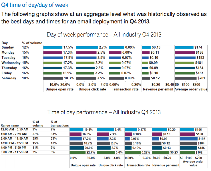
It looks like weekends, between 8pm and 4am, are the best times and days to send emails. The open rates, click through rates, and revenue per email are higher than weekday mails. Oddly enough, the number of emails sent on weekends is considerably lower than on weekdays, meaning there’s less competition for you.
Another good starting point is to subscribe to competitors’ emails and note down when they send out emails. Don’t directly copy their timing but use it as a template for your own testing.
Your own data might have some useful information about your customers’ habits. Look for when you have the most purchasing or browsing activity happening on your site and test delivery around those times.
eBags looked at their email subscribers sign up times and sent emails at the same time. This led to a 20% rise in click through rates and a 65% rise in conversion rates.
2. Subject lines
Before customers click on products in your email, they need to open it first. Since the volume of already overwhelms most people email they receive, they’re quick to delete email that don’t seem promising.
You need to capture their attention with your subject lines. You don’t just want them holding off on the delete button, you actually want them opening your email the moment they see it. That’s the power of a captivating headline.
Here are some ideas to try out in your next email campaign:
Introduce Urgency
Introducing urgency is a known psychological tactic used in making a sale. It tells a person that something they might want is available for a short time and that they should get it before they miss out. This works best for mails about a deal or promotion.
Here’s a case study from Whirlpool where they emailed customers a $400 saving on one of their product lines and tested the following subject lines for open rates:
- A: Savings end soon! Save up to $400 on select Whirlpool Ice Kitchen Collections
- B: Save up to $400 on select Whirlpool Ice Kitchen Collections
Now version A is just version B with the phrase ‘Savings end soon!’ prefixed to it. However, this little addition added urgency to it and resulted in higher open rates.
Personalize It
Personalization isn’t just about using a customer’s name in the subject line. It’s about using keywords or phrases that resonate with your audience.
Take this example from Vero. They tested two subject lines for the same email by removing one word and switching another:
- A: [Vero] The free trial ending email that works
- B: The free trial ending email that converts.
The word ‘converts’ resonates more with Vero’s CRO-focused audience and resulted in a 15% increase in opens and a 50% increase in clicks.
Build Curiosity
This one is obvious. If you make customers curious, they’ll want to know more and they’ll open your emails.
President Obama’s campaign emails leveraged A/B testing to maximize their reach.. We’ll look at it in greater detail later but for now let’s see how A/B testing headlines increased their open rates.
Regular donation request emails started with “Stick with me, <first name>”. Short and personalized, but it doesn’t build any curiosity. After testing multiple subject lines, they found a clear winner: “I will be outspent”.
Now that’s interesting. President Obama being outspent during elections is newsworthy and it drove people to click on the email and respond to it. This single email went on to help them raise over $2.6 million.
3. E-mail Design
Unlike SaaS businesses, eCommerce relies heavily on the good design to make sales. So while most SaaS businesses have more success with simple plain text emails, eCommerce businesses tend perform better with image-heavy HTML mails.
Of course, this adds another level of complexity. Not only do you need to worry about the content, you also need to test designs and layouts. On top of that, different types of emails will require different layouts.
Here’s an example of a new product release email from Amazon. It starts with a full-width feature section on top for the new product, with a large image, full title, product details and a captivating CTA.
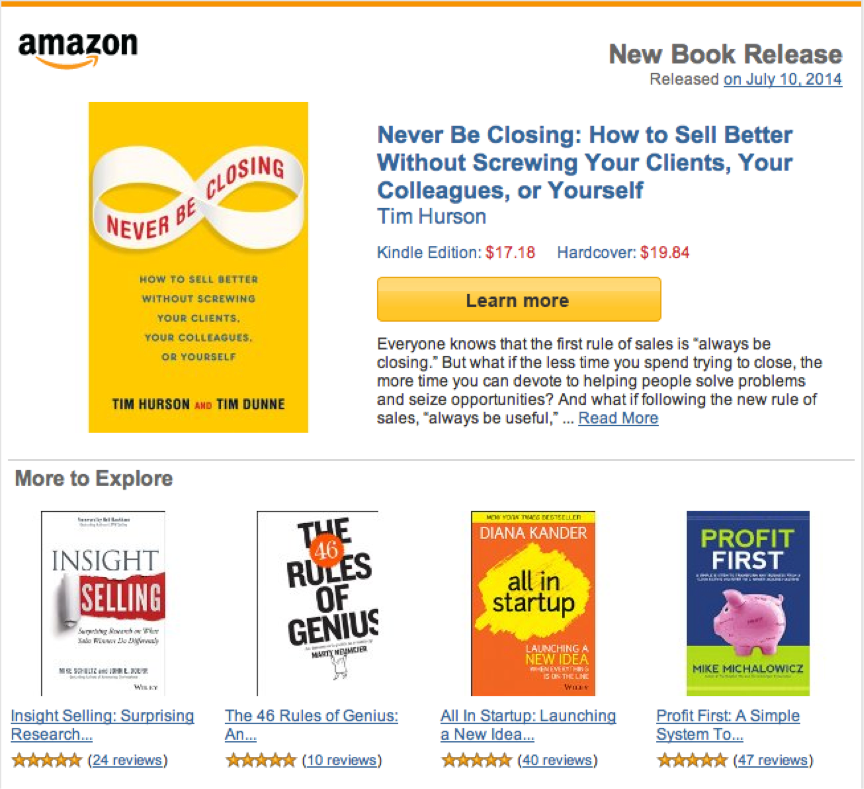
This layout places the most important product up on top and follows it up with related suggestions in case the featured product isn’t interesting.
Now, here’s their product recommendation email.
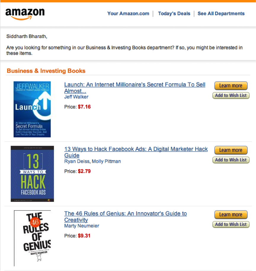
It’s basically a list of products based on browsing history. (This is a great example of behavioral email.) Each one might be equally interesting to the customer, so there’s no featured area on top. They might want to test if a blurb for each product increases click through rates. Or maybe they’ve already tested it and decided that a minimalist design sells more.
On the other hand, Heirlume’s product recommendation emails start with text. There’s a big CTA to read more followed by three product recommendations in a row. This new design increase click-through rates by 3% compared to their regular emails.
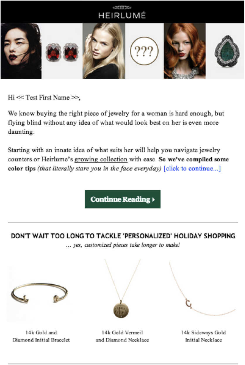
As you can see, different layouts work for different campaigns and different stores. Your audience may want a bit to read before looking at products, like Heirlume discovered, or they may just want to quickly scan products like Amazon customers. It’s up to you to test and find out.
4. Copy
The Heirlume email’s success was a result of a strong design and strategic layout but also persuasive copy. By personalizing their messages to customers, they were able to capture their interest and get them to click to learn more.
The Obama donation campaign understood the significance of good copy. They had a team of 20 writers testing multiple versions of content in every email. And it paid off: they raised $50 million on the strength of persuasive content.
Much like subject lines, copy needs to keep a customer’s attention long enough for them to read the whole thing and click through. If you’re emailing about a deal, keep the urgency going. If it’s a product recommendation email, make it personalized.
Here’s an example of how Evo used content to reduce returns and build up to an up-sell. They created a three-part series for customers who had just bought their ski boots (another good example of behavioral marketing).
- The first email was a guide to using their new boots. It reached customers a day after they had ordered, making it extremely relevant and highly likely that they’ll click through and read. The aim was to familiarize customers with their new boots.
- The second email came a few days later after customers had actually received the product in the mail. It was a guide on making the boots fit well so that customers wouldn’t feel they got the wrong size. Again, it’s a very relevant email.
- Finally, after the customer has tried the boots on for a couple of days, they send an email about their ski socks. The email continues with the theme of making boots comfortable and explains how socks will enhance their experience.
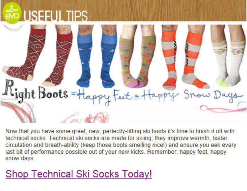
Notice how they first built trust and engagement with well-timed, relevant and personalized emails before innocuously up-selling their other product. It was a massive difference from their regular product recommendation emails and led to an increase in CTR of 904%!
5. CTAs and Microcopy
The call to action is the final component of your email. It’s the critical conversion point that turns readers into website visitors and buyers. If you don’t get this right, your entire email campaign fails.
We’ve already seen various examples of CTAs in the case studies above. Amazon has the yellow ‘Learn More’ button while Evo has a large text link. Different styles work for different companies.
In the Whirlpool case study, the number of CTAs in the email was tested. The control email was much like Amazon’s new product release email, with one large CTA above and three small ones below.
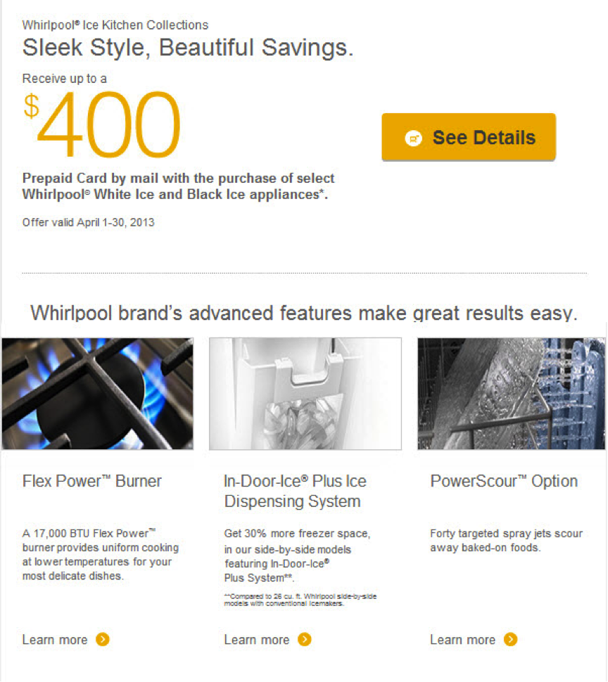
This was tested against a new version with only the top CTA. The reasoning was that fewer CTAs meant fewer distractions. This turned out to be correct and the new version increased click through rates by 42%.
While the shape, size and color of the buttons matter, the actual wording on them will let customers know what’s coming. Most of the above examples use a standard ‘Learn more’ but Doggyloot does something different in their cart abandonment emails.
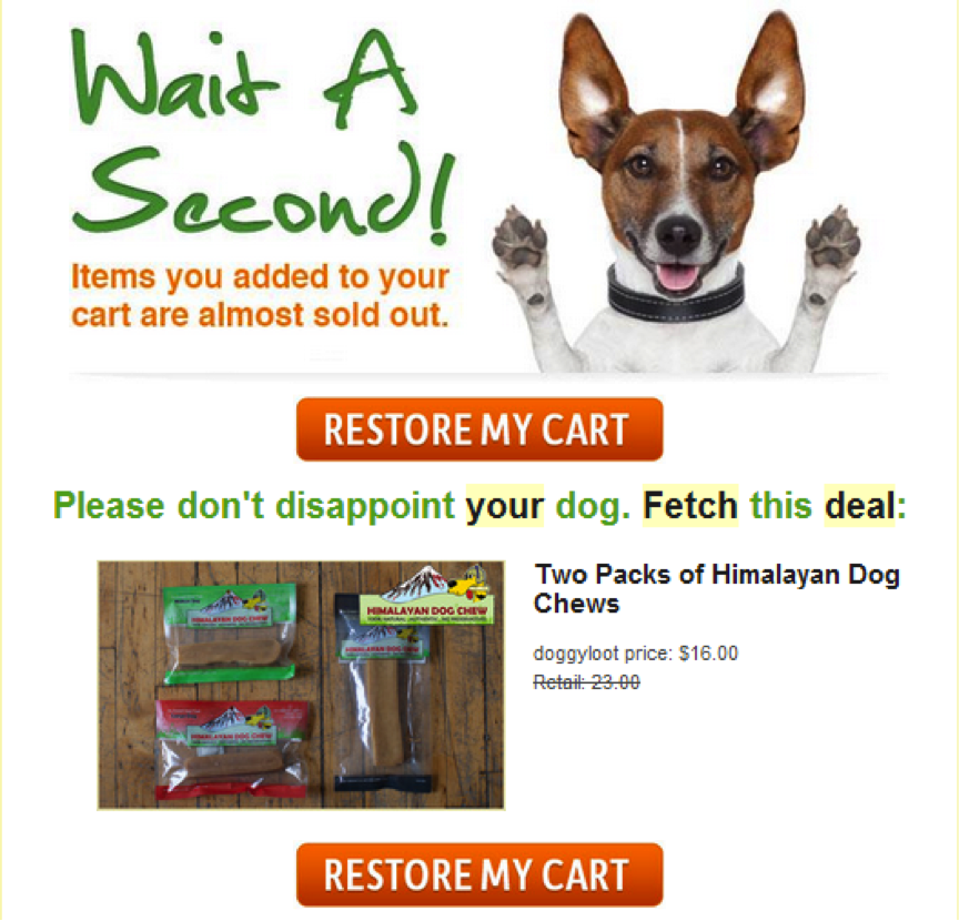
The email copy is all about introducing urgency by letting customers know that the products they had in their cart are almost sold out. The button continues the theme by asking customers to restore their carts. The implied message is that if they don’t restore it, their product will be lost. This led to a 750% increase in click through rates.
Get Started
Now that you know what you can test and have some ideas to copy, go set up your first A/B test. Remember that the process is no different than A/B testing a website. You need to have an objective and hypothesis for each test, and you need to run them for a sufficient amount of time to get valid results.
Bookmark this page and come back here when you run out of testing ideas. If any of your tests lead to a big improvement in conversion rates, let us know in the comments below.

